


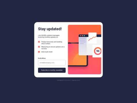
@bkarabo754Submitted over 1 year ago
Latest solutions
Responsive landing page for a News Home Page using tailwind and React
#tailwind-css#reactSubmitted over 1 year agoResponsive Design for Base Apparel using Tailwind CSS and React
#tailwind-css#reactSubmitted over 1 year agoResponsive Ping coming soon page with TailwindCSS and React
#react#tailwind-cssSubmitted over 1 year ago
Latest comments
- @vishnu-31Posted over 1 year ago
Hello there. Congrats on completing the chalenge.
I have some suggestions to improve.
- you should create another
divand have these 2 'div's inside it and givep-0(no padding). - and also
m-0*(no margin)*and remove other margin elements on these 2divs -this will remove the space between thedivs and show them always together at all the screen size.
Marked as helpful0 - you should create another
- @RrashdiSubmitted over 1 year ago@vishnu-31Posted over 1 year ago
Hello there. Good job on completing the challenge. I have some suggestions to improve.
- you could add a pixel value for
widthattribute to the container class and right class - So that the image is always inside the container and
- the container doesn't resize to window size until the breakpoint is hit
Marked as helpful0 - you could add a pixel value for