Design comparison
Solution retrospective
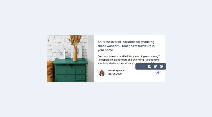
Hello, everyone. Completed the Article preview Component using Tailwind and React
any feedback to improve will be helpful.
thank you.
Community feedback
- @MelvinAguilarPosted 12 months ago
Hello there ๐. Good job on completing the challenge !
I have some suggestions about your code that might interest you.
-
For a photo of a person, use their name as the alt text.
-
Social media icons should be links with the icon image, allowing users to easily navigate to the respective social media pages.
-
The
<div>
tag can be useful for styling and positioning, but it doesn't convey any semantic meaning. Instead, consider using more semantic elements like<p>
to better describe the type of content
I hope you find it useful! ๐ Above all, the solution you submitted is great!
Happy coding!
Marked as helpful1@vishnu-31Posted 12 months ago@MelvinAguilar Thanks for the input. I will implement them.
1 -
Please log in to post a comment
Log in with GitHubJoin our Discord community
Join thousands of Frontend Mentor community members taking the challenges, sharing resources, helping each other, and chatting about all things front-end!
Join our Discord