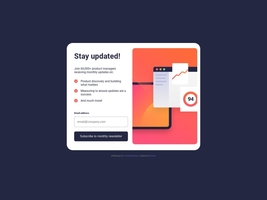
Design comparison
SolutionDesign
Please log in to post a comment
Log in with GitHubCommunity feedback
- @vishnu-31
Hello there. Good job on completing the challenge. I have some suggestions to improve.
- you could add a pixel value for
widthattribute to the container class and right class - So that the image is always inside the container and
- the container doesn't resize to window size until the breakpoint is hit
Marked as helpful - you could add a pixel value for
Join our Discord community
Join thousands of Frontend Mentor community members taking the challenges, sharing resources, helping each other, and chatting about all things front-end!
Join our Discord
