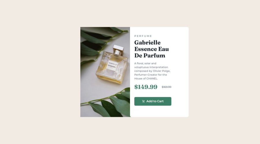
Product Preview Card Component with React & Tailwindcss
Design comparison
Solution retrospective
I have completed the product preview card. I would appreciate your feedback :)
Community feedback
- @MelvinAguilarPosted over 1 year ago
Hello there 👋. Good job on completing the challenge !
I have other suggestions about your code that might interest you.
-
Utilize
min-h-screen(ormin-height: 100vh) instead ofh-screento prevent your component from getting shortened on mobile devices. -
The image has a margin that is too large, specifically
md:ml-[252px]. Consider removing it for better alignment. -
The issue I notice is that you are creating two columns with
grid-cols-2but using the same element to center them. As mentioned by Vishnu_31, consider creating another div to exclusively contain these two columns for better structure. like this:<div class="bg-cream min-h-screen w-screen flex flex-col items-center justify-center"> <div class="grid grid-cols-1 md:grid-cols-2"> <article ...></article> <div ...></div> </div> </div>
- You can use the
<picture>tag when you have different versions of the same image 🖼. Using the<picture>tag will help you to load the correct image for the user's device saving bandwidth and improving performance. You can read more about this here 📘.
I hope you find it useful! 😄 Above all, the solution you submitted is great!
Happy coding!
Marked as helpful0@bkarabo754Posted over 1 year agoThank you so much @MelvinAguilar, this is really helpful. I will look into it and make the necessary changes. Thank you once again, sir. :)
1 -
- @tesla-ambassadorPosted over 1 year ago
Hey Bongani Masango, Congrats on completing your challenge! I had a look at your code and found that you set
flex-colwithout settingflexfirst in your tailwind css. This would have enabled you to use flex instead of grid which would be great for this solution and then you'd change toflex-rowat the desired screen width. This would prevent your divs from separating. Otherwise, I think this is really great!Marked as helpful0@bkarabo754Posted over 1 year agoHi @tesla-ambassador, I appreciate your feedback, I will look at it. Thank you for pointing that out sir. :)
1 - @vishnu-31Posted over 1 year ago
Hello there. Congrats on completing the chalenge.
I have some suggestions to improve.
- you should create another
divand have these 2 'div's inside it and givep-0(no padding). - and also
m-0*(no margin)*and remove other margin elements on these 2divs -this will remove the space between thedivs and show them always together at all the screen size.
Marked as helpful0@bkarabo754Posted over 1 year ago@vishnu-31 Thank you for the feedback, sir. I will work on it :)
0 - you should create another
Please log in to post a comment
Log in with GitHubJoin our Discord community
Join thousands of Frontend Mentor community members taking the challenges, sharing resources, helping each other, and chatting about all things front-end!
Join our Discord
