tomhaeck
@tomhaeckAll comments
- @leviipopeSubmitted about 2 months ago@tomhaeckPosted about 2 months ago
Your solution is remarkably close to the design jpg. Very nice job!
Here are some wonderings that I like about your work, or might otherwise improve it:
- Text like 'Perfume' (class
.item-type) is wrapped in a<div>element, which is less semantic than e.g. a<h*>element or a<p>element. Same goes for the text 'Gabrielle Essence Eau de Parfum'. - You used viewport units
vwto set the dimensions of the product card. Great! - You add both the desktop and mobile image in two separate
<img>elements and you toggle between them usingdisplay: none. What I used in my solution is the CSS propertycontent: url("...")that can change the value of thesrcattribute of an<img src="...">element. I don't know which one is better, but both seem to do the trick. - To vertically align the product's text items, I suggest you use a Flexbox container, instead of setting ad hoc
margin-bottoms for each text item.
0 - Text like 'Perfume' (class
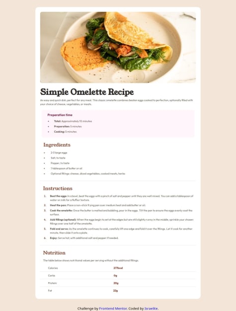
- @Israel-O-JohnSubmitted about 2 months agoWhat are you most proud of, and what would you do differently next time?
Learnt about CSS :: marker
What challenges did you encounter, and how did you overcome them?Page responsiveness but I created a media query for it
What specific areas of your project would you like help with?Wanted to apply lazy loading to the web page but couldn't. How should I go about it?
@tomhaeckPosted about 2 months agoNice work! Some general remarks:
-
widths, heights, paddings and margins are sometimes a little off with respect to the design file. Some are subtle and do not matter that much, but e.g. the width of the recipe's white box is a little annoying.
-
other details are beautifully taken care off, like the borders and font properties of the nutritional elements.
-
I like the fact that you did a 'CSS reset' by declaring
box-sizing: border-boxandmargin: 0on all elements. -
The nutritional table is not really declared as a table in the HTML code. The result is visually the same, but it makes semantically more sense to declare it a table maybe?
-
The width of the recipe image is declared
max-width: 100%. This is problematic for really big screen sizes, where the image will not fill the full width of the recipe box. -
The font properties of some headers can be grouped. For instance: you declare the same font properties for
.instructions h4and.nutritions h5, so it makes more sense to declare these font properties on the<h4>elements in general. -
Beware of typos, like e.g.
.nuritions! It looks a little sloppy and makes it harder for your reviewer. I suggest to use a spelling checker in your IDE.
Marked as helpful1 -
- @jevcenkokozlovskaSubmitted about 2 months ago@tomhaeckPosted about 2 months ago
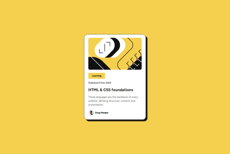
Your solution looks very much alike the challenge's design! Good job!
- you used a nested CSS Flexbox to center both the card in the body and to layout the content in the card. Nice.
- you often use rem units instead of absolute pixel sizes, which is a good habit.
Some remarks to improve your solution even further:
- Don't forget to add active states when you hover over the buttons.
- It might make sense to group all buttons within a
<div>element or some other (semantic) element.
0 - @GatdeyummSubmitted 2 months ago@tomhaeckPosted 2 months ago
Hi @Gatdeyumm,
Your solution is nearly pixel-perfect! Great job. The card height is not exactly right, but that is a minor detail.
I like that your solution code is very concise/compact/very readable, making it very easy for a reviewer. There is some CSS code for the footer that is added to
index.html, maybe it is better to also move that tostyle.css.I noticed that you added a hover state for the card that changes the card's boxshadow. I didn't add that myself in my solution. Well spotted:-)!
Marked as helpful0 - @MariekafSubmitted 3 months ago@tomhaeckPosted 2 months ago
Hi @Mariekaf,
The QR card does not seem centered in the page. I suggest you have a look at CSS Flexbox, which provides a neat way to do such centering (both horizontally and vertically). CSS-tricks.
I also notice that the typeface does not correspond to the one in the solution. In the CSS property
font-family, you specify the Google link to the typeface as a value, but I assume this value cannot be correctly interpreted and the browser falls back to a default type.Marked as helpful0


