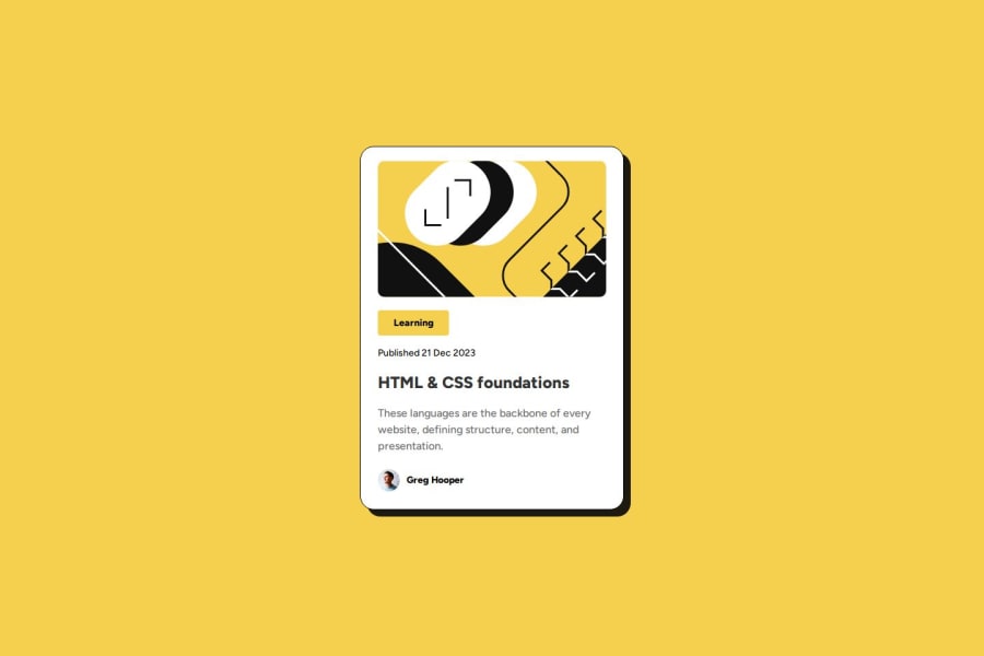
Design comparison
Community feedback
- P@tomhaeckPosted 7 months ago
Hi @Gatdeyumm,
Your solution is nearly pixel-perfect! Great job. The card height is not exactly right, but that is a minor detail.
I like that your solution code is very concise/compact/very readable, making it very easy for a reviewer. There is some CSS code for the footer that is added to
index.html, maybe it is better to also move that tostyle.css.I noticed that you added a hover state for the card that changes the card's boxshadow. I didn't add that myself in my solution. Well spotted:-)!
Marked as helpful0 - @nandiniindralePosted 7 months ago
yes it include semantic HTML and also this code well-structured,redable and reusable
Marked as helpful0
Please log in to post a comment
Log in with GitHubJoin our Discord community
Join thousands of Frontend Mentor community members taking the challenges, sharing resources, helping each other, and chatting about all things front-end!
Join our Discord
