Nice work! Some general remarks:
-
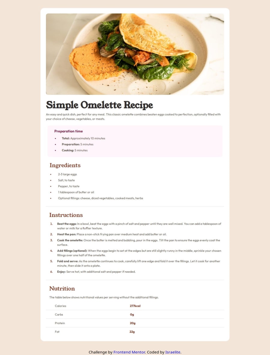
widths, heights, paddings and margins are sometimes a little off with respect to the design file. Some are subtle and do not matter that much, but e.g. the width of the recipe's white box is a little annoying.
-
other details are beautifully taken care off, like the borders and font properties of the nutritional elements.
-
I like the fact that you did a 'CSS reset' by declaring
box-sizing: border-boxandmargin: 0on all elements. -
The nutritional table is not really declared as a table in the HTML code. The result is visually the same, but it makes semantically more sense to declare it a table maybe?
-
The width of the recipe image is declared
max-width: 100%. This is problematic for really big screen sizes, where the image will not fill the full width of the recipe box. -
The font properties of some headers can be grouped. For instance: you declare the same font properties for
.instructions h4and.nutritions h5, so it makes more sense to declare these font properties on the<h4>elements in general. -
Beware of typos, like e.g.
.nuritions! It looks a little sloppy and makes it harder for your reviewer. I suggest to use a spelling checker in your IDE.
Marked as helpful
@Israel-O-John
Posted
Thank you @tomhaeck so much. I will improve on these points.

