Submitted about 2 months ago
Social links profile with css grid

@jevcenkokozlovska

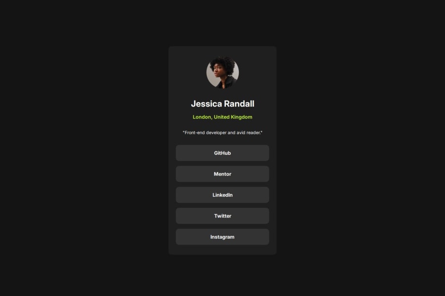
Design comparison
SolutionDesign

Community feedback
- @tomhaeckPosted about 2 months ago
Your solution looks very much alike the challenge's design! Good job!
- you used a nested CSS Flexbox to center both the card in the body and to layout the content in the card. Nice.
- you often use rem units instead of absolute pixel sizes, which is a good habit.
Some remarks to improve your solution even further:
- Don't forget to add active states when you hover over the buttons.
- It might make sense to group all buttons within a
<div>element or some other (semantic) element.
0

Please log in to post a comment
Log in with GitHubJoin our Discord community
Join thousands of Frontend Mentor community members taking the challenges, sharing resources, helping each other, and chatting about all things front-end!
Join our Discord