@YossefMagdySubmitted almost 2 years ago

tan
@tan911All comments
- @tan911Posted almost 2 years ago
Hello @YossefMagdy,
Here's my recommendation for improving this app if you have some free time,
- Keyboard support. User should be able to use keyboard to navigate this app.
- The image should be positioned so that it is both horizontally and vertically centered.
- Your app should be responsive.
Despite this, excellent job on the task!
Hope this will help improve, Thanks!
0 - @UriasmanuSubmitted almost 2 years ago@tan911Posted almost 2 years ago
Hello @Uriasmanu,
css:
- Instead of giving your body element precise width and height definitions, you may utilize the display flex attribute to automatically center the content.
- Employ specify width in the main class for your cards.
- You place the button and card using absolute position everywhere. For positioning the content and the button, I advise using flex or grid.
More info:
Hope this will help, Thanks!
Marked as helpful0 - @AlexanderMontoyaSubmitted almost 2 years ago@tan911Posted almost 2 years ago
Hello @AlexanderMontoya,
It placed I think bacause you defined your quotation image in an absolute position. The z-index and opacity will not solve the problem unless if you defined your text also. To address your error, you can use the quotation image as background image of your 'testimonial one' class and placed it wherever you want using background-position.
more info:
Hope this will help, Thanks!
Marked as helpful1 - P@ucod3Submitted almost 2 years ago@tan911Posted almost 2 years ago
👋Hello, @ucod3, and congratulations on completing this challenge🎉. Here's my suggestion and to answer some of your questions as well.
- In tailwindcss you can refactor your classes by using layers in your main css file, instead of styling your buttons individually with the same classes, just put your one style in 'style.css'.
- I think the ratings styles of clicked button will confused your user of selecting it and also the functionality there is broken.
more info:
adding custom style in tailwind
Hope this will help, Thanks!
1 - @ereljapcoSubmitted about 2 years ago@tan911Posted about 2 years ago
It's okay to import 'notificationList' directly to the component's who needs it. Also you can pass 'notificationList' as props. However when passing it as props I think it's read not a notificationList, the code looks like this,
import Header from './components/header/Header';
import Notifications from './components/notifications/Notifications';
import notificationsList from './data/notificationsList';

export default function App() {
  const [read, setRead] = useState(notificationsList);

  return (
    <main className="main">
      <section className="notifications">
        <div className="c-notifications">
          <Header setRead={setRead}  notificationsList={read} />
          <Notifications />
        </div>
      </section>
    </main>
  );
}
You use 'useState' with initial value of 'notificationsList'. You don't need to pass 'notificationList' itself instead use the 'read' variable to pass data into your children component.
Marked as helpful1 - @Decimo-10Submitted about 2 years ago@tan911Posted about 2 years ago
Hello @Decimo-10, Here's my suggestion that might improve your applications also to answer some of your questions as well.
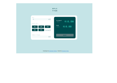
- I think you should, and they should be inside the fieldset if you want to make "Select Tip %" a label. Also you can use
input="radio"for every percentage and hide it via visually-hidden class or sr-only class instead of normal button element and don't forget to add label to every input radio button. - You can use javascript to handle the validations for the input type text. If you do this, then you have to check if the input value can be converted by a number or not. If it is, do the calculations otherwise just give an error message there. When providing an error message you can add aria-describeby to your input element with the same value to the id of your error message or to your span element. This will benificial to your audience who use screen readers.
<div class="label-wrapper"> <label for="bill-input" class="input__label">Bill</label> <span id="your-error" class="input__error-message">Can't be zero</span> </div> <input type="text" id="bill-input" aria-describedby="your-error" class="input__field" placeholder="0" inputmode="numeric" pattern="[1-9][0-9]*\.?[0-9]*">Marked as helpful1 - I think you should, and they should be inside the fieldset if you want to make "Select Tip %" a label. Also you can use
- @ElomolinaSubmitted about 2 years ago@tan911Posted about 2 years ago
Hello @Elomolina, An accordion should have keyboard support when it is built. This is beneficial to your audience since they can now use the keyboard to navigate your app. You can read this guide if you're interested in making an accessible accordion. - Accordion Example WAI ARIA.
0 - @almeida883Submitted about 2 years ago@tan911Posted about 2 years ago
Hello @almeida883, Looks good. However, in mobile there's no padding on the right side of your content and the screen.
0 - @LisandraFerrazSubmitted about 2 years ago@tan911Posted about 2 years ago
Hello @LisandraFerraz, your implementation is good because it supports the keyboard. However, try scaling your screen down to 320px, and your application is still not entirely responsive, and the background image is not aligned. Additionally, I am unable to scroll it vertically, you should enable this so that the content of your application is viewable regardless of the audience's screen size (height or width). If you want to improve the accessibility of your application you can refer this guide of building accessible accordion - Accordion example - WAI ARIA
Marked as helpful0 - @ViniciusMassariSubmitted about 2 years ago@tan911Posted about 2 years ago
Hello @ViniciusMassari, your application should have a keyboard support, you can use button element instead of dl element. button has accessibility features such as, tabs key, shift+tabs key or you can read this guide of making accessible accordion. When building an accordion try this - Accordion example
Marked as helpful1 - @ninjabroSubmitted about 2 years ago@tan911Posted about 2 years ago
Hello @ninjabro, I dont know why you add max width to your body element even if you set display flex the content will not centered on larger screen, try to scale up you screen to 1440px up. You can add max-width to your main element if you want. Also you can wrap your image wih div element instead of header, the image there is just decorative.
Marked as helpful1 - @AndrewFerrer000Submitted about 2 years ago@tan911Posted about 2 years ago
Good work, but I don't know why you set your root element with the font size of 18px. try to change your default font-size in your browser with 1440px screen size up. So in larger screen even if you set your h1 font-size with rem doesn't make any sense. Also, I figure out that your application isn't responsive try to scale down your screen up to 320px. for padding and margin it will depend on you as long as you know the difference between rem and em.
If you want to set the font size of your root element you can read this guide - https://www.freecodecamp.org/news/override-root-font-size-for-a-better-user-experience/
you can use em for media queries then rem font size - https://medium.com/zoosk-engineering/to-em-or-not-to-em-that-is-the-media-query-question-22f4a65e9747
Hope this will help. Thanks.
Marked as helpful0 - @heionim31Submitted about 2 years ago@tan911Posted about 2 years ago
Hello, @heion31 👋. Your solution appears to be perfect, however when I reduce the size of my screen to 376px, the layout does not change as expected (it is supposed to do so by 600px for better mobile experience). Your font size is quite small on the widescreen, in order for your audience to read the text, they must modify the browser's default font size which is not a good idea because you didn't allow your content to scroll it vertically.
Hope this will help. Thanks.
Marked as helpful2 - @danyczechSubmitted over 2 years ago@tan911Posted over 2 years ago
Hello 👋, @danyczech. Congratulations on completing your second task 🎉.
-
Since you've included background images in your HTML, you might want to try using the picture element. - more info https://www.w3schools.com/html/html_images_picture.asp
-
Adding flexbox to your body element will allow you to center your content. if you do mind, The resulting code will look like: body { display:flex; justify-content: center;align-items: center}
Hope this will help, Thanks.
Marked as helpful0 -
- @Ogochukwu-ugoSubmitted over 2 years ago@tan911Posted over 2 years ago
Hello, @Ogochukwu-ugo,
- Try using rem for font-size, use this tool https://nekocalc.com/px-to-rem-converter to convert you px to rem.
- To remove accessibility report try wrap your content with main element or you can put a role attribute with the value of main in your div element.
Hope this will help, Thanks.
Marked as helpful0 - @nicofercavv-devSubmitted over 2 years ago@tan911Posted over 2 years ago
Hello @nicofercavv-dev, maybe this will improve your code:
- Don't use h3 without h2 and it's best practices to use heading element in order.
- Use "rem" for font-sizes instead of pixels, so that your audience can be able to see the text base on their preferred font sizes.
Hope this will help improve your code, Thanks.
Marked as helpful0 - @JeremyPaymalSubmitted over 2 years ago@tan911Posted over 2 years ago
Hello @JeremyPaymal, maybe this will help and improve your code:
- Wrap your content with "main" element or use a "role" attribute for your div with the value of "main", so it should look like this: <div role="main" class="content"></div>. I suggest you should use main element as sematic html for accessibility and best practices.
- Do not use pixels for font sizes instead use rem for that, so that your audience can be able to see the text base on their preferred font sizes.
Hope it helps, Thanks.
Marked as helpful0 - @Mohsin-93Submitted over 2 years ago@tan911Posted over 2 years ago
Hello @Mohsin-93, maybe this will help and improve your code:
- Wrap your content with "main" element or use a "role" attribute for your div with the value of "main", so it should look like this: <div role="main" class="card"></div>.I suggest you should use main element as sematic html for accessibility and best practices.
- Use "h1" instead of "h2", you should not skip h1, therefore don't use h2 without h1 and same with h3-h6. - Do not use pixels for font sizes instead use rem for that, so that your audience can be able to see the text base on their preferred font sizes.
Hope it helps, Thanks.
Marked as helpful1