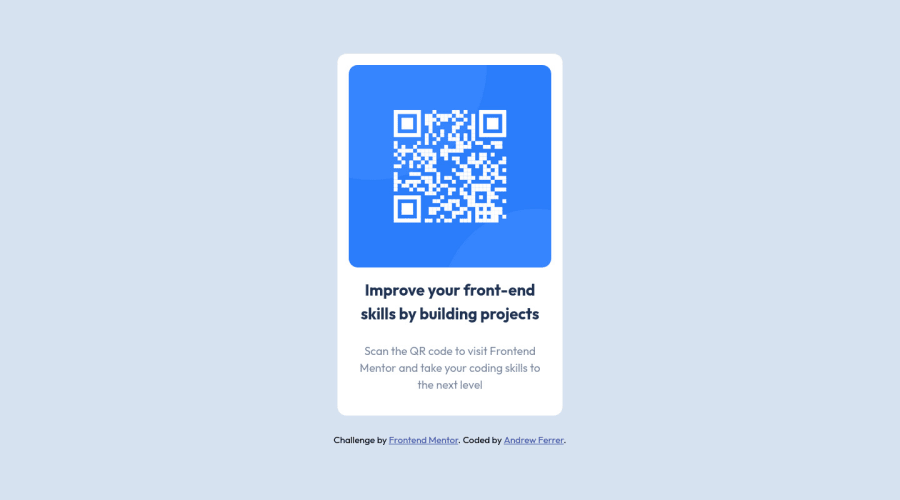
Design comparison
Solution retrospective
- I just learned how to use
remandemhowever I am not really sure where can I put them correctly, in this challenge I just use them everywhere suchfont-sizepadding marginand even inwidthof the div/img. Did I use them correctly?
Community feedback
- @tan911Posted over 2 years ago
Good work, but I don't know why you set your root element with the font size of 18px. try to change your default font-size in your browser with 1440px screen size up. So in larger screen even if you set your h1 font-size with rem doesn't make any sense. Also, I figure out that your application isn't responsive try to scale down your screen up to 320px. for padding and margin it will depend on you as long as you know the difference between rem and em.
If you want to set the font size of your root element you can read this guide - https://www.freecodecamp.org/news/override-root-font-size-for-a-better-user-experience/
you can use em for media queries then rem font size - https://medium.com/zoosk-engineering/to-em-or-not-to-em-that-is-the-media-query-question-22f4a65e9747
Hope this will help. Thanks.
Marked as helpful0@AndrewFerrer000Posted over 2 years ago@tan911 Thank you very much, I already read the link you suggests, and I will try to use them in my next challenge.
1
Please log in to post a comment
Log in with GitHubJoin our Discord community
Join thousands of Frontend Mentor community members taking the challenges, sharing resources, helping each other, and chatting about all things front-end!
Join our Discord
