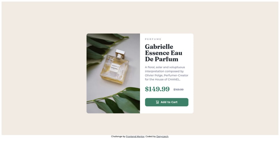
Responsive component - product card - using flexbox
Design comparison
Solution retrospective
Hi there!
My second task. Any suggestions? I was thinking about putting those images as the background-image, but finally, I let them as part of the HTML and used display: none when needed. I am not sure which solution is better or the best practice.
Community feedback
- @Bhikule19Posted over 2 years ago
You can do this alternative method:- So what happening here is, if the screen width is more than 800px it will use the desktop version of the image that you will provide, whereas when the screen comes to less than 780px it will implement the mobile version of that image.
<picture>
  <source media="(max-width: 780px)" srcset="mobile-image.jpg" />
  <source media="(min-width: 800px)" srcset="desktop-image.jpg" />
  <img src="desktop-image.jpg" alt="" />
</picture>
You can visit:- Developer docs by mozilla
If you found this insightful, you can mark this comment as helpful Thank you.
Marked as helpful1 - @tan911Posted over 2 years ago
Hello 👋, @danyczech. Congratulations on completing your second task 🎉.
-
Since you've included background images in your HTML, you might want to try using the picture element. - more info https://www.w3schools.com/html/html_images_picture.asp
-
Adding flexbox to your body element will allow you to center your content. if you do mind, The resulting code will look like: body { display:flex; justify-content: center;align-items: center}
Hope this will help, Thanks.
Marked as helpful0 -
Please log in to post a comment
Log in with GitHubJoin our Discord community
Join thousands of Frontend Mentor community members taking the challenges, sharing resources, helping each other, and chatting about all things front-end!
Join our Discord
