@TaiwolaSubmitted almost 2 years ago
I had issues with the background image for the header, seems to not be working, any advice on how to resolve them

I had issues with the background image for the header, seems to not be working, any advice on how to resolve them
Your page is not viewable after I click on the "preview site" button.
Looks good. I used this code on mine to make the button look a little more like the model:
box-shadow: 11px 11px 15px -10px rgba(109, 99, 109, 0.73);
Hey, I would really appretiate some feedback on how you see I can improve or optimize my code!
I would love to know also how can I solve the issue that I currently have with the background quotes image when hovering on the first testimonial on the Desktop view.
Thanks!
Hello. Delete the background img from your html file, then add this to your css code:
.t1 {
  background-color: hsl(263, 55%, 52%);
  background-image: url(/images/bg-pattern-quotation.svg);
  background-size: 110px;
  background-position: top 5px right 30px;
  background-repeat: no-repeat;
}
That will fix the background. Also delete the code under .quotes-img...
I like how you did it all with flexbox.
It's the fourth challenge, please advise!
The cards should have a slight box-shadow. Everything else looks very nice.
Feedback is free, please
Hello, Oluwasegun. You should always include landmarks. Learn more about them here: https://www.w3schools.com/accessibility/accessibility_landmarks.php
Never use pixels for font sizes. Use rem.
Include hover states for links:
a:hover {
   color: blue;
}
... or whatever the color.
For the buttons you can change the opacity to something like .7.
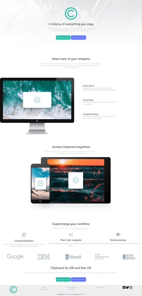
The two sections under "Supercharge your workflow" should be smaller. Smaller fonts and smaller brand images.
The big apple monitor image is moved slightly to the left. You can do that with:
   position: relative;
    left: -80px;
This project was easy to get going but got progressively tougher as I continued to push forward. My main issue that I had with this project was that I feel that I overused far too many selectors, so much so that I had to redo the project from scratch. After I redid it from scratch, I proceeded to go down that rabbit hole again and made too many selectors, although I didn't mess up the project this time so I just turned it in. Any tips for grid would be greatly appreciated! Finally, I corrected the centering for the project but it hasn't updated on my end yet with github. Thank you all for helping me!
Looks good. The text on the first card should be white. You have margin-top: 2.5rem; on cards 3, 4 and 5, which is making the space between paragraphs bigger than on cards 1 and 2.
Hi guys, I am new to this community and I would like to know your opinion about this landing page. I joined this community because I really want to improve my HTML and CSS, so I really appreciate your advice and opinions.
Looks good. Add the hover states to the buttons and the footer links.
I'm still not get used with transform translate anyone can help? I'll appreciate with it :)
For text under the h1 in the hero section, it looks like you used the font Poppins. It should be "Open Sans." The text in the cards should be gray.
Do you know how to add the icons from fontawesome.com? If you do, Please, tell me how to do it in the comments below
Need padding toward the top, on top of the logo image. Remove background-size: cover from the body to fix the background. Make button text bold. Looks really good. I see some things on yours that I missed on mine.
welcome with your feedback
I have 32px for border-radius on mine. Your brand images toward the bottom are big and stretched. I changed the width of mine to 100px.