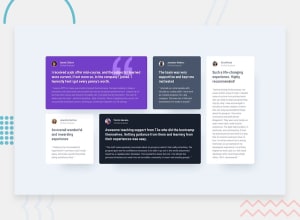
Design comparison
Solution retrospective
This project was easy to get going but got progressively tougher as I continued to push forward. My main issue that I had with this project was that I feel that I overused far too many selectors, so much so that I had to redo the project from scratch. After I redid it from scratch, I proceeded to go down that rabbit hole again and made too many selectors, although I didn't mess up the project this time so I just turned it in. Any tips for grid would be greatly appreciated! Finally, I corrected the centering for the project but it hasn't updated on my end yet with github. Thank you all for helping me!
Community feedback
- @VCaramesPosted almost 2 years ago
Hey there! 👋 Here are some suggestions to help improve your code:
- The profile images alt tags need to be improved. It should state the following; “Headshot of -person’s full name-“
More Info:📚
- The names of each individual are headings so they should be wrapped in a Heading Element. Since they are all equal level of importance, the
h2heading will be the best choice.
- improve the semantics of your component, you will want to wrap each individual testimonial component in a Figure Element, the individuals information should be wrapped in a Figcaption Element and lastly, the testimonial itself should be wrapped in a Blockquote Element.
Code:
<figure>
   <figcaption></figcaption>
   <blockquote></blockquote>
</figure>
More Info:📚
If you have any questions or need further clarification, feel free to reach out to me.
Happy Coding!🎄🎁
Marked as helpful0@mikej321Posted almost 2 years ago@vcarames Hey there, vcarames and thanks so much for all of the help that you have given me on my journey. I truly do appreciate it. I didn't even know that there were special rules for headshot alts...I'm going to read that article that you linked immediately! With the headings, I know that you aren't supposed to use more than one H1. Is it okay to use more than one H2 and above if necessary? Thanks in advance!
1@VCaramesPosted almost 2 years ago@mikej321
Glad I could help!
Your code has definitely improved since you first started!
The
h2would be the best option.Keep it up!
0 - @t0ntinPosted almost 2 years ago
Looks good. The text on the first card should be white. You have margin-top: 2.5rem; on cards 3, 4 and 5, which is making the space between paragraphs bigger than on cards 1 and 2.
1@mikej321Posted almost 2 years ago@t0ntin Thanks so much! I knew the text looked off but couldn't see exactly why!
0
Please log in to post a comment
Log in with GitHubJoin our Discord community
Join thousands of Frontend Mentor community members taking the challenges, sharing resources, helping each other, and chatting about all things front-end!
Join our Discord
