

Design comparison
SolutionDesign

Solution retrospective
Feedback is free, please
Community feedback
- @t0ntinPosted almost 2 years ago
Hello, Oluwasegun. You should always include landmarks. Learn more about them here: https://www.w3schools.com/accessibility/accessibility_landmarks.php
Never use pixels for font sizes. Use rem.
Include hover states for links:
a:hover {
   color: blue;
}
... or whatever the color.
For the buttons you can change the opacity to something like .7.
The two sections under "Supercharge your workflow" should be smaller. Smaller fonts and smaller brand images.
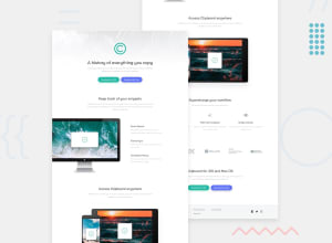
The big apple monitor image is moved slightly to the left. You can do that with:
   position: relative;
    left: -80px;
Marked as helpful0@BensaxxyPosted almost 2 years ago@t0ntin thanks so much boss, i will work on that, I really appreciate
0

Please log in to post a comment
Log in with GitHubJoin our Discord community
Join thousands of Frontend Mentor community members taking the challenges, sharing resources, helping each other, and chatting about all things front-end!
Join our Discord