
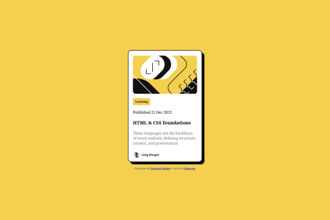
@osuulolaSubmitted 19 days ago

ramiadi
@ramiadiAll comments
- @ramiadiPosted 17 days ago
Hey, I noticed you're using a lot of <div> tags in your code. Have you considered leveraging HTML's semantic elements for better structure and accessibility? I personally using these tags <details> and <summary> instead of <div> tags when using toggle.
Marked as helpful1 - @DiogoGaspar6Submitted 6 months ago
- @osuulolaSubmitted 3 months ago@ramiadiPosted 3 months ago
i see you are using alot of div elements. You should use div less. example <div class="container">, instead of div, you can use main. i see you have a trouble with the accessibility.Maybe try another approach? i personally use mobile first approach. Makes it easier to have more responsive page on different width sizes.
Marked as helpful0 - @canbldSubmitted 4 months ago
- P@ismailhasirSubmitted 3 months ago
- @jrybarskiSubmitted 4 months ago@ramiadiPosted 4 months ago
Many media queries overlap. An example is the difference between (min-width: 50em) and (min-width: 80em). Make sure the rules don't conflict:
0 - @jrybarskiSubmitted 4 months ago@ramiadiPosted 4 months ago
i see you that the icons (images are on the left side, not right). Personally i wouldnt make a div for the images. Instead of making a div, just put img there and in the css: float:right; to make the image on the right side.
Your code is easily and well readable. Same goes with the design.
I like you use different media queries for different sizes!
0 - P@gianmromeroSubmitted 6 months agoWhat are you most proud of, and what would you do differently next time?
Understanding of flexbox, I will use grid layout next time.
What challenges did you encounter, and how did you overcome them?Improving my understanding about web elements.
What specific areas of your project would you like help with?About the asterisk property. I knew it's not a good practice but it works for me this time. What I can do to avoid this practice?
@ramiadiPosted 6 months agoNice design and coding here! i see you are using alot of px. Thats not a problem but i suggest to use rem or em when it comes to margins, padding and font-sizes. Use rem/em when you want it to be adaptive to the scale of the system. For example, if you use rem or em the size will change which adds accessability for people that have it harder to read.
thats all i got, keep it up!
0 - @nisukmaaSubmitted 6 months agoWhat are you most proud of, and what would you do differently next time?
- adjust responsive layout at mobilee view
- forgot some tag, because i was not exercise on almost 1 months
- diffcult to arrange align of picture
@ramiadiPosted 6 months agoNice code you got there. There is still improvements you can do. The first one is up to you. I personally make a folder and put my css in there for styling. This is because the html file can be alot of lines making it harder to see and understand. The second is i see you are using alot of pixels on everything. I recommend you to use rem or em when you use padding and margins because it makes the website more responsive. Lastly i want to point out is when you make the width of your website smaller, the box doesnt react to that well. the elements are almost hidden. Maybe try min-width:100vw;
Anyways a good structure! I like your layout. I see you are using few divs and this is a good practise! The less is better. I want to point out its unique method of using article, i sure didnt use it. By the way nice table you made. Keep it up!
0 - @AshlavaDevSubmitted about 1 year agoWhat are you most proud of, and what would you do differently next time?
I am most proud of how quickly this project came together with relative ease. Like previous project, I would maybe experiment with a component library instead if I do it again.
What challenges did you encounter, and how did you overcome them?The challenge I did face was the social links styling. I originally had each link in a span, and then applied the styling class to the span. (a span was used instead of an a tag as there was no need to make them actual links) However, to organize the links I used an unordered list and made each link a list item, which messed with the style. The solution was to remove the span tags altogether and just use the style class on the li tags.
What specific areas of your project would you like help with?There is no specific area I feel I need help with.
@ramiadiPosted 6 months agogood thing about the element "li". The code is easily readable
0 - @LapupehSubmitted 6 months ago@ramiadiPosted 6 months ago
Your code is overall well-structured and follows good HTML and CSS practices. It is easy readable.
I have some suggestions to make it a little bit better. Note: this is small things but once you have learnt it, its good for making a website. In the svg element, make sure to put an "alt" attribute in there. This makes the accessibility better.
To ensure that text is more responsive and readable across devices, you can consider using units like rem or em instead px units.
Overall, you are doing a good job with this code! The structure is clean and your use of code is nicely. You have taken care of design elements like alignment, spacing and color, which shows an attention of detail that makes the design well!
0 - @CodeurDHonneurSubmitted 6 months agoWhat are you most proud of, and what would you do differently next time?
Pour commencer, je suis assez heureux d'avoir pu réaliser la maquette.
What challenges did you encounter, and how did you overcome them?Le respect des break points pour le responsive
What specific areas of your project would you like help with?- j'aimerais avoir des conseils sur la manière d'organiser le code css.
- comment pourrais-je optimiser les propriétés CSS que j'ai pu utiliser pour écrire moins de lignes de code
- Est-ce que le choix de mes balises pour le HTLM est optimal ?
@ramiadiPosted 6 months agoYou can reduce repetition by using more general rules. For example, instead of specifying font sizes separately for p and body, you can use e.g. font-size: 15px on body.
Your use of media queries works fine for different screen sizes. It is good that you have taken into account larger screens in addition to small screens.
You have already started using CSS variables, which is a good practice.
Instead of using lots of padding and margin adjustments for placement, you can use display flex or grid to structure the layout better. This will give you better control over how elements are placed, especially on different screen sizes.
With these adjustments, your code will be both more readable and optimized, but it is already easy to see and understand your code. Good job!
0