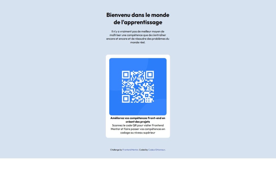
Design comparison
Solution retrospective
Pour commencer, je suis assez heureux d'avoir pu réaliser la maquette.
What challenges did you encounter, and how did you overcome them?Le respect des break points pour le responsive
What specific areas of your project would you like help with?- j'aimerais avoir des conseils sur la manière d'organiser le code css.
- comment pourrais-je optimiser les propriétés CSS que j'ai pu utiliser pour écrire moins de lignes de code
- Est-ce que le choix de mes balises pour le HTLM est optimal ?
Community feedback
- @ramiadiPosted 6 months ago
You can reduce repetition by using more general rules. For example, instead of specifying font sizes separately for p and body, you can use e.g. font-size: 15px on body.
Your use of media queries works fine for different screen sizes. It is good that you have taken into account larger screens in addition to small screens.
You have already started using CSS variables, which is a good practice.
Instead of using lots of padding and margin adjustments for placement, you can use display flex or grid to structure the layout better. This will give you better control over how elements are placed, especially on different screen sizes.
With these adjustments, your code will be both more readable and optimized, but it is already easy to see and understand your code. Good job!
0@xNyfPtxPosted 6 months ago@ramiadi it is ok to have some repetition in your code, also you shouldn't change the base font-size no matter what in your code. using px for font-sizes is very inaccesible also
0
Please log in to post a comment
Log in with GitHubJoin our Discord community
Join thousands of Frontend Mentor community members taking the challenges, sharing resources, helping each other, and chatting about all things front-end!
Join our Discord
