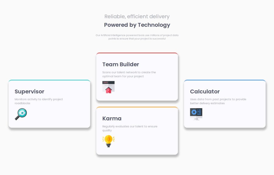
Design comparison
Community feedback
- P@wraith-wallPosted 4 months ago
The solution includes semantic HTML, looks accessible and the layout looks well on a range of screen sizes. The code is well-structured, readable, and reusable. The solution differs from the design slightly, but looks even better than the design.
0 - @ramiadiPosted 4 months ago
i see you that the icons (images are on the left side, not right). Personally i wouldnt make a div for the images. Instead of making a div, just put img there and in the css: float:right; to make the image on the right side.
Your code is easily and well readable. Same goes with the design.
I like you use different media queries for different sizes!
0
Please log in to post a comment
Log in with GitHubJoin our Discord community
Join thousands of Frontend Mentor community members taking the challenges, sharing resources, helping each other, and chatting about all things front-end!
Join our Discord
