Any tips on improving the responsiveness in next projects?
Abdulqudus Sanusi
@qudus2019All comments
- @Alix144Submitted over 1 year ago@qudus2019Posted over 1 year ago
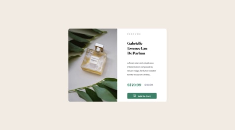
Congratulations on your solution, You've done a wonderful job. However you should work on the responsiveness. Add the following to your
.container```max-width:90%; height:[work on the height, vh unit is not advisable for the container ]```1 - @ZascuOfficialSubmitted over 1 year ago
Hello!
I would like to know how I could have made the heading and the paragraph of the card shrink down in width without having to use
margin-inlineinside of the card.Thanks in advance!
@qudus2019Posted over 1 year agoCongratulations on your solution, Zascu
You do not actually need the
margin-inlineproperty. Thetext-align: centeris enough to keep the texts at the center and they will automatically shrink as the parent element's width reduced1 - @Boukerdenaa-SofianeSubmitted over 1 year ago@qudus2019Posted over 1 year ago
Congratulations on your solution, Sofiane
Just few suggestions:
- Increase the width of your container
- Increase the container text padding
- Use
mix-blend-mode: multiplyto blend the image color
Marked as helpful0 - @loifloroSubmitted about 2 years ago
I have a question in my mind, is it impossible to use the document.getElementByClassNames for getting class names, because the one I used is document.querySelector to get the class names?
@qudus2019Posted about 2 years agoYes sure, to grab more than one elements with a class name, it's possible to use getElementsByClassName instead of querySelectorAll.
The former returns a HTML collection and you can't use Array methods on it like forEach(), Map() etc. Unless you convert the collection to an Array first.
The latter returns a Node list that can accept the above mentioned methods.
Thank you
Marked as helpful1 - @White-WalnutSubmitted over 2 years ago
Is there a way to change the picture base on device width without using media queries?
@qudus2019Posted over 2 years agoCongratulations on your solution Michael, Another way to change pictures without using media queries is by using the <picture> element.
Marked as helpful0 - @farazali00Submitted over 2 years ago
mistakes are accepted!
@qudus2019Posted over 2 years agoTo reduce the accessibility issues, always use landmarks in your html
1 - @farazali00Submitted over 2 years ago
mistakes are accepted!
@qudus2019Posted over 2 years agoCongratulations on your solution Faraz. It's a great step in the right direction. Here are few tips to make it look better:
- Use Grid layout with two rows and three columns
- The card on the left will span two rows and one column on the left.
- The card on right will span 2 rows and one column on the right
- The other two cards will span one row each and on the same column.
- Give your grid-container align-items property and value of center
Marked as helpful1 - @archibald7812Submitted over 2 years ago@qudus2019Posted over 2 years ago
Fantastic!! I suggest increasing the height of the card and bottom padding of the second div containing texts
0 - @SaadYasinSubmitted over 2 years ago@qudus2019Posted over 2 years ago
Great job! I have few suggestions:
- Reduce the left and right padding.
- Increase height of the button.
- Increase the bottom padding.
- Increase don't size. Nice job overall!
0 - @DimiPavlovSubmitted over 2 years ago@qudus2019Posted over 2 years ago
Weldone Dimitav, i noticed there is no border radius. Also, the headers are meant to have different font from the paragraph.
1


