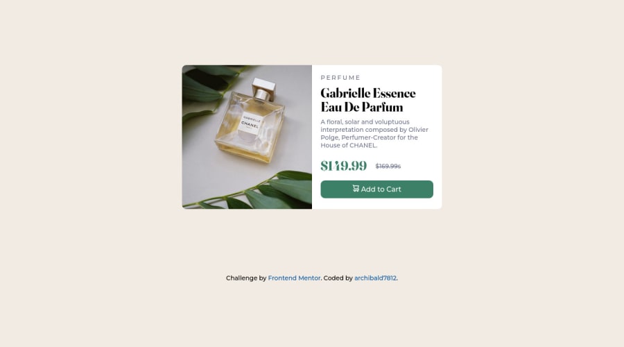
Design comparison
SolutionDesign
Community feedback
- @qudus2019Posted over 2 years ago
Fantastic!! I suggest increasing the height of the card and bottom padding of the second div containing texts
0
Please log in to post a comment
Log in with GitHubJoin our Discord community
Join thousands of Frontend Mentor community members taking the challenges, sharing resources, helping each other, and chatting about all things front-end!
Join our Discord
