Design comparison
Solution retrospective
mistakes are accepted!
Community feedback
- @qudus2019Posted over 2 years ago
Congratulations on your solution Faraz. It's a great step in the right direction. Here are few tips to make it look better:
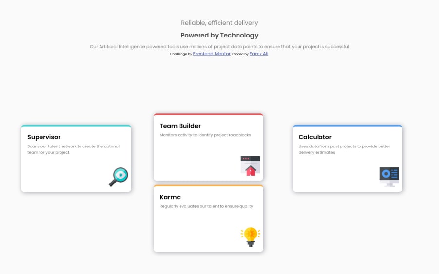
- Use Grid layout with two rows and three columns
- The card on the left will span two rows and one column on the left.
- The card on right will span 2 rows and one column on the right
- The other two cards will span one row each and on the same column.
- Give your grid-container align-items property and value of center
Marked as helpful1 - @qudus2019Posted over 2 years ago
To reduce the accessibility issues, always use landmarks in your html
1@qudus2019Posted over 2 years ago@farazali00 landmarks are used to group content together for better accessibility and SEO;
Examples of landmarks are : main tag, header tag, footer tag, div tag , section tag, article tag ,aside tag:
Use case example : In the code below, main tag, header tag, footer tag and div tag with class of student, are serving as landmarks. Main tag groups the main content in your HTML together.
In the above, div groups related info together i.e h1 and p.
    <body>
       <header></header>
        <main>
           <div class="student">
               <h2>Student</h2>
                 <p>Student description</p>
              </div>
          </main>
<footer></footer>```
Marked as helpful1
Please log in to post a comment
Log in with GitHubJoin our Discord community
Join thousands of Frontend Mentor community members taking the challenges, sharing resources, helping each other, and chatting about all things front-end!
Join our Discord
