nilmus
@nilmusAll solutions
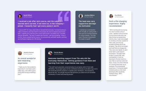
Testimonials Grid Section
#sass/scssSubmitted 5 months agoI couldn't really mirror the design's wide margin around the grid, in the desktop view, because when I tried increasing the margin, the grid overflowed
Four card feature section
Submitted 6 months agoI really struggled with this one.
For the desktop card layout, I used grid and specified the position of each card, but this feels hacky, is there a better way?
It was also my first time using BEM and I'm not sure I did it right.
Product Preview Card Component
Submitted 6 months agoThis was my first responsive design ever, so any feedback on responsiveness is appreciated.
One thing regarding fluid typography: when using
clamp()I'm just going through trial and error to figure out values that look good, is there a better approach?Recipe Page
Submitted 6 months agoI gave up at adhering to the mobile design because I had no idea how to make the padding of only the top image disappear on smaller screens. Any clue is highly appreciated.
Social Links Profile
Submitted 6 months agoThe challenge "Ideas to test yourself" section includes:
"Ensure visitors can navigate the links only using their keyboard."
I don't know how to do that
Blog Preview Card
Submitted 6 months agoThe challenge page includes this prompt:
"The font sizes in this project are slightly smaller in the mobile layout. Find a way to reduce font size for smaller screens without using media queries."
But I don't know how to do that.


