Design comparison
Solution retrospective
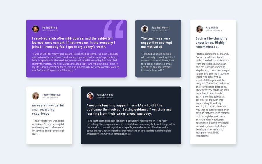
I couldn't really mirror the design's wide margin around the grid, in the desktop view, because when I tried increasing the margin, the grid overflowed
Community feedback
- @lgwardaPosted 5 months ago
To fix the overflow and mirror the wide margin design correctly, here’s the approach:
Apply a Reset/Normalize Stylesheet: Reset all default margins, paddings, and box-sizing to prevent unwanted behavior.
Use box-sizing: border-box; to include padding and borders inside the element’s width and height, preventing overflow.
Set box-sizing: border-box; Globally: This is a common practice to ensure all elements’ padding and borders are included in their total width and height, which helps avoid overflow issues.
Adjust the margin and padding Carefully: Once the reset is applied, you can confidently control the margin and padding without worrying about overflow.
0
Please log in to post a comment
Log in with GitHubJoin our Discord community
Join thousands of Frontend Mentor community members taking the challenges, sharing resources, helping each other, and chatting about all things front-end!
Join our Discord
