Solution retrospective
What specific areas of your project would you like help with?
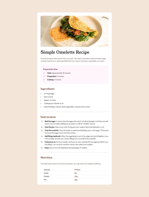
I gave up at adhering to the mobile design because I had no idea how to make the padding of only the top image disappear on smaller screens. Any clue is highly appreciated.
Code
Loading...
Please log in to post a comment
Log in with GitHubCommunity feedback
No feedback yet. Be the first to give feedback on nilmus's solution.
Join our Discord community
Join thousands of Frontend Mentor community members taking the challenges, sharing resources, helping each other, and chatting about all things front-end!
Join our Discord