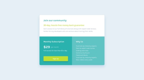
newtothis90
@newtothis90All comments
- @hitmorecodeSubmitted over 1 year ago@newtothis90Posted over 1 year ago
I see the stars aren't inline with the review rating.
Since that is your current markup, you could try making your ".stars" class flex-direction: row;
instead of
flex-direction: column;
.stars{ flex-direction: row; }
and then you may or may not need to adjust the width of the ".stars" class
Otherwise, looks awesome man!
Keep going!
Marked as helpful0 - @OLLEMSSubmitted over 1 year ago
I found it a little easy, but I had difficulties and felt insecure with CSS, especially when creating geometric shapes, I looked for ways to understand my problems, and I managed to solve them, I didn't like the semantics of my code, but I'm going to work on it, I loved using the @font-face, gave me confidence in what I did and git was complicated, because I ended up forgetting to commit changes along the way, however it is my first solo project, I will work on it!
@newtothis90Posted over 1 year agoYour font isn't showing up as it is supposed to.
I don't believe you can just link to the google fonts URL using font-face.
I'd look into just going to the google webfonts page and using their <link>
such as:
<link rel="preconnect" href="https://fonts.googleapis.com"> <link rel="preconnect" href="https://fonts.gstatic.com" crossorigin> <link href="https://fonts.googleapis.com/css2?family=Outfit&display=swap" rel="stylesheet">You would place those tags in the <head> of your html document and then you are free to use the font wherever you would like!
Good Job and Happy Coding!
Marked as helpful0 - @Abolude30Submitted over 1 year ago
looking forward to your beneficial inputs and corrections.
@newtothis90Posted over 1 year agoJust a few things I noticed:
-
Try increasing the padding on your .parent-div div{} Perhaps try starting at 30px and go from there.
-
The button width is way too large and the height isn't tall enough.
-
The button margin from the paragraph needs to be longer.
Sidenote: If you are familiar with Grid, you could easily space all of your elements out vertically.
It looks really good other than those few items! Great Job and Keep Going!
0 -
- @MattHenriqueMSSubmitted over 1 year ago@newtothis90Posted over 1 year ago
Everything looks great! The one thing I immediately noticed is that the "line-height" isn't correct on the <h1> and on the product description.
Otherwise it looks awesome!
Happy Coding!
Marked as helpful1 - @JacoappolinarioSubmitted over 1 year ago@newtothis90Posted over 1 year ago
IN THIS INSTANCE, there's no need to give your <img> a class name at all since you are already using img{}. Giving it a class isn't wrong at all, but a little less code with not giving them a class.
Hope this helps somewhat. If you have a reason for giving them a class of .image, please explain. I would love to hear your opinion.
Regardless, GREAT JOB!
0 - @JenaCarrySubmitted over 1 year ago@newtothis90Posted over 1 year ago
Great work! Looking at your CSS actually helped me learned a few things!
0 - @kelseythesimSubmitted over 1 year ago@newtothis90Posted over 1 year ago
I can see your text is aligned left, so perhaps look into centering the text with css.
text-align: center;
Enjoy!
0


