Skip to content


Beta Member
This badge is a shoutout to the early members of our community. They've been around since the early days, putting up with (and reporting!) bugs and adjusting to big UX overhauls!
Mentor of the Week - 3rd Place
This badge is awarded to the 3rd placed community member on the weekly Wall of Fame.
Fun fact
The Hansen Writing Ball shown in the badge was the first commercially produced typewriter. It was put into production in 1870 with its unique ergonomic design. It was overtaken in the market in 1873 by the Sholes and Glidden typewriter which was the first keyboard to utilise the QWERTY layout we now use today.
Mentor of the Week - 2nd Place
This badge is awarded to the 2nd placed community member on the weekly Wall of Fame.
Fun fact
Keypunches were used in early computing to punch precise holes in stiff paper card. The punched cards were then used for data input, output, and storage. No code linters or auto-complete suggestions to help out back then! 😅
Mentor of the Month - 2nd Place
This badge is awarded to the 2nd placed community member on the monthly Wall of Fame.
Fun fact
The computer in this badge is loosely based on the Commodore PET which was one of the earliest home computers launched in 1977. It came with 4 KB of RAM...that's not a typo!
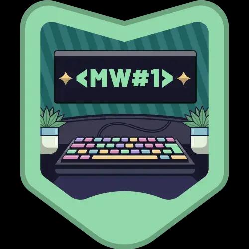
Mentor of the Week - 1st Place
This badge is awarded to the top placed community member on the weekly Wall of Fame.
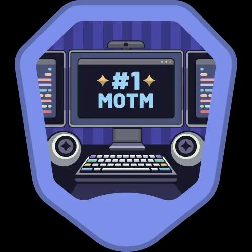
Mentor of the Month - 1st Place
This badge is awarded to the top placed community member on the monthly Wall of Fame.