

Design comparison
SolutionDesign

Community feedback
- P@loki-pepePosted 3 months ago
Regarding your HTML, I think a
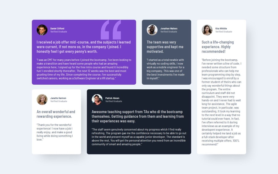
por ablockquoteelement would be better suited for the quotes, while the cards themselves could bearticleelements, but I was unsure how to best semantically structure the page myself.Your CSS is well written and responsive, the only thing you could have perhaps done was setting a layout for medium sized devices and tweak the sizing and paddings/margins to get it just right. (Also note the card header color of the original design, the opacity should be 100%).
A few touches from perfect, well done.
0

Please log in to post a comment
Log in with GitHubJoin our Discord community
Join thousands of Frontend Mentor community members taking the challenges, sharing resources, helping each other, and chatting about all things front-end!
Join our Discord