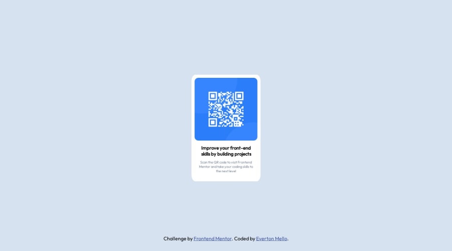
Design comparison
Solution retrospective
I found it a little easy, but I had difficulties and felt insecure with CSS, especially when creating geometric shapes, I looked for ways to understand my problems, and I managed to solve them, I didn't like the semantics of my code, but I'm going to work on it, I loved using the @font-face, gave me confidence in what I did and git was complicated, because I ended up forgetting to commit changes along the way, however it is my first solo project, I will work on it!
Community feedback
- @newtothis90Posted over 1 year ago
Your font isn't showing up as it is supposed to.
I don't believe you can just link to the google fonts URL using font-face.
I'd look into just going to the google webfonts page and using their <link>
such as:
<link rel="preconnect" href="https://fonts.googleapis.com"> <link rel="preconnect" href="https://fonts.gstatic.com" crossorigin> <link href="https://fonts.googleapis.com/css2?family=Outfit&display=swap" rel="stylesheet">You would place those tags in the <head> of your html document and then you are free to use the font wherever you would like!
Good Job and Happy Coding!
Marked as helpful0@OLLEMSPosted over 1 year ago@newtothis90 awww, Ok, let me try this, thank you for your feedback, i have to much problems, its is my first code alone, thank u so much! :D
0 - @NehalSahu8055Posted over 1 year ago
Hello Coder 👋.
Congratulations on successfully completing the challenge! 🎉
Few suggestions regarding design.
-
Remove
margins
frombody
as it will not dynamically center the card. -
To properly center the card
-
USING FLEXBOX
body{ min-height: 100vh; display: flex; align-items: center; justify-content: center; }
- Use
Semantics
for the proper design of your code. - In this project we do not need
<nav>
so remove it
<body> <main> your main content goes here... </main> <footer>...</footer> wrap up `.attribution(challenge by....)` div inside your footer. </body>
-
For
non-decorative images
give meaningful and descriptive alt likealt= "QR code to frontend mentor website"
. -
Use
responsive units(rem, em, %)
from next project. Explore respective use cases on google. -
Replace
width
withmax-width
to make your card more responsive.
link.
I hope you find this helpful.
Happy coding😄
Marked as helpful0 -
Please log in to post a comment
Log in with GitHubJoin our Discord community
Join thousands of Frontend Mentor community members taking the challenges, sharing resources, helping each other, and chatting about all things front-end!
Join our Discord