Hi Vishal,
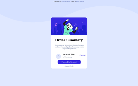
Good job with completing this challenge
If yo don't mind, here's some improvements you can make:
Accessibility issues:
These are easy fixes such as using html landmarks (<main>, <header>, <footer>) instead of putting all of your content inside <div> tags.
Font: The font that is in the design is provided in the style-guide.md file, where you can go to google fonts, add the font and paste the link into your html / css document.
Centering Content :Rather than using display: absolute, you can effectively center your content using css Flexbox, by putting the code in a container and using
display: flex;
align-items: center;
justify-content: center;
Responsive Design: I would suggest taking a look at Media Queries to understand how to make a website responsive, which just means it will look good on a mobile device with a smaller pixel width.
Hope this helps, and let me know if you have any other questions!