Fadilano• 70
@Fadilano
Submitted
please give me suggestion for better solution and what should i learn next?
@nachospreafico
@Fadilano
Submitted
please give me suggestion for better solution and what should i learn next?
@nachospreafico
Posted
Hello Fadilano!
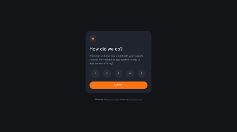
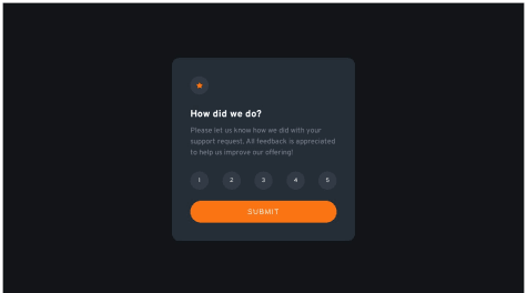
The design looks great. I just want to comment on the functionality: you are not handling the case of submitting without choosing any score.
If I submit with no score selected, where I should read "You selected X out of 5" it just says "none".
I didn't have a chance to go through your code, but from the UX part of it, that's what I saw.
Happy coding!
Marked as helpful
@NikNT
Submitted
Hi everyone!
This was an exciting project. Although it was simple but there were some elements that made me think. I believe I have made the solution close to the specified design.
Please let me know what you think about me and most importantly, if there are any improvements or suggestions - please do provide them. I'll be happy to learn about my mistakes and identify the scope for improvement.
Thanks!
@nachospreafico
Posted
Hello Nikhil, hope you are doing great!
I just wanted to give you my feedback for what I've seen:
This is what I've seen at very quick glance. Hope you find it useful.
Happy coding!
Marked as helpful
@BuzzFizzer
Submitted
console.log("Hello Programmers"),
This is my first project ever using TypeScript and Vue.js, and I hope I did a decent job.
Technologies Used:
Naming Convention:
Difficulties Encountered:
Questions:
If you have any suggestions on how I can improve my code, I would greatly appreciate it if you could leave a comment. Thank you in advance. (✿◠‿◠)
@nachospreafico
Posted
Hey Caramello! Really loving your feed. Although I don't use TS or Vue, I find your work nicely organized and the designs really on point.
Keep it up, you are really on to something! Happy coding.
@mahedee007
Submitted
@nachospreafico
Posted
Hello, Maheedee!
Nice job with this challenge. I just want to give my feedback:
Other than that, it looks good. I haven't had the time to go through your code, but from the UX side, that's what I can see.
Cheers, and happy coding!
Marked as helpful
@moritzrose
Submitted
I definitely put in "required" for my email input, it worked yesterday...it doesn't work today...I didn't change a thing :D any help?
@nachospreafico
Posted
Hello!
I noticed 2 things in your code:
On a side note, using HTML’s required attribute is super useful of course but you should try to add your own validations with JavaScript.
Hope this comment is helpful. Happy coding!
@arunc93
Submitted
@nachospreafico
Posted
Hello! I really liked your project. I noticed you used querySelector instead of getElementById or class; that is my approach too!
This is my feedback:
I hope this comment is of help to you. Happy coding!
@mcodes97
Submitted
I would like help making it responsive for mobile
@nachospreafico
Posted
Hey, loved the desktop version. For making it responsive for mobile, I suggest you take a look at media queries. In short, they allow you to create styles depending on the screen's size.
Good luck and happy coding!