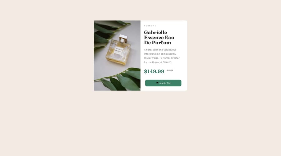


Design comparison

Solution retrospective
I would like help making it responsive for mobile
Community feedback
- @itushPosted over 1 year ago
Congratulations on completing the challenge! 🎉
-
To make it mobile responsive it is important to first understand how the breakpoints work with the media queries, which breakpoints to target etc.
-
Feel free to go through my product preview project code and notice how I handle responsiveness with mobile and desktop product images.
In my projects:
- I always start with mobile-first workflow.
- I use at least one main element for a page (entire content goes into the main, if I'm not using header & footer), and avoid divs as much as possible and use section and article element wherever I can.
<body> <main> All content </main> </body>-
I Use relative units as much as possible and avoid absolute units whenever possible.
-
If you are someone who is just starting out with front-end development, I strongly suggest starting with the QR code component project(which you did). Also in the challenges page you may filter by (Newbie, HTML&CSS) sort by (easier first) to select projects that will help you solidify your foundation. To avoid any potential knowledge gap⚠️ please first solidify HTML, CSS, JS fundamentals and then move on to any framework or library.
-
I remember when I started out, I made countless mistakes and spent long hours searching for solutions. But hey, you don't need to go through the same struggles! 🙌 To help you shorten the learning curve, I recommend going through the following articles. They contain valuable insights that can make your journey smoother:
📚🔍 12 important CSS topics where I discuss about css position, z-index, box-model, flexbox, grid, media queries, mobile-first workflow, best practices etc. in a simple way.
📚🔍 11 important HTML topics where I discuss about my thought process and approach to convert a design/mock-up to HTML along with important topics like block and inline elements, HTML Semantic Elements.
I hope you find these resources helpful in your coding adventures! 🤞
I'm eagerly looking forward to seeing the amazing projects you'll create in the future! 🚀💻
Keep up the fantastic work and happy hacking! 💪✨
1@mcodes97Posted over 1 year ago@itush
• If I would to start with mobile-first when making this project, would it be easier to make it a desktop site afterwords? I had an issue already going from desktop to mobile, so I am wondering if it would be the same.• I am still getting used to using other elements in my HTML, I'll try to use less divs when making small projects like these. Is that not the way to do things?
• I find it hard to position things when after using flexbox, so I typically go to relative and absolute positioning. How could I avoids those moving forward?
• I also thank you for the extra information guidance for my next project. I'm excited to keep learning! I'll check out the links you sent shortly, thank you, thank you! 🙌
1@itushPosted over 1 year ago@mcodes97
You are most welcome!
-
mobile-first workflow is a tried and tested approach and easier than the opposite workflow.
-
You may use divs when there is no scope left for HTML semantics. This will be more clear to you with practice.
-
Yes, it is important to correctly understand CSS Position property to render HTML elements as per the requirement. Please note:
-
By default, all HTML elements are static (non-positioned elements).
-
By using top, right, bottom, left we can control the final location of an HTML element.
-
Top, right, bottom, left, z-index don’t have any effect on Statically positioned / non-positioned elements.
-
So, basically, we first need to convert a non-positioned element to a positioned element using (relative/fixed/absolute/sticky) then only (top/right/bottom/left/z-index) etc. will work for the targeted element.
-
If you patiently read both the articles, I'm sure most of your doubts will be cleared if not all.
-
Feel free to ask more questions :)
BTW: It would motivate me to provide quality support like this to the community, if you could spare a moment and give my GitHub pinned projects a ⭐️ star.
1 -
- @nachospreaficoPosted over 1 year ago
Hey, loved the desktop version. For making it responsive for mobile, I suggest you take a look at media queries. In short, they allow you to create styles depending on the screen's size.
Good luck and happy coding!
1@mcodes97Posted over 1 year ago@nachospreafico I'd love some pointers if you have some making media queries. I tried a few but I could not get it to work out. Things didn't align unfortunately. 😢
0@nachospreaficoPosted over 1 year ago@mcodes97 Hey there! I would suggest you read the docs here https://developer.mozilla.org/en-US/docs/Web/CSS/CSS_media_queries/Using_media_queries.
TL;DR: media queries allows you to apply different styles depending on different screen sizes (which screen sizes depend on your target devices and the breakpoints are yours to apply). Let me give you an example:
@media only screen and (max-width: 425px) { /* Apply styles for devices/screens with width up to 425px*/ }
@media only screen and (min-width: 1280px) { /* Apply styles for devices/screens with width starting at 1280px*/ }
In this example I declared 2 breakpoints: one up to 425px (for mobiles) and the other larger than 1280px (usually desktop or large laptops). Anything outside those 2 breakpoints will be applied disregarding screen widths. Also, anything outside those 2 breakpoints won't have any of the styling declared inside the breakpoints (so if you, say, are using a tablet [usually around 768px], you will only see the styles that are outside both breakpoints).
Of course there is much more than this, but this is how I use media queries. For more detailed info, go check the link I left at the top of this reply.
Have a great day and keep coding!
1


Please log in to post a comment
Log in with GitHub
Join our Discord community
Join thousands of Frontend Mentor community members taking the challenges, sharing resources, helping each other, and chatting about all things front-end!
Join our Discord