@SavindushehanSubmitted about 1 year ago
please tell me my errors.

please tell me my errors.
Great job overall. For of all apply the property to the whole section border-bottom-right: 2rem or more to match the design. You may find the icon and the line are not align. Apply the property display:flex align-items:center, and justify-content:center and gap:10px to make it align. Nice work
Pretty easy assignment compared to the rest
Great job. Reduce the font size of the heading text. Moreover, give padding to overall text to make your solution much better
The only thing that was difficult for me was to add a button the displays the previous advice. I am not sure of the button the displays the next advice because it some how slow.
Change the box color to somewhat lighter color to make it standout from its background. Great job
Nice try. For background, use linear-gradient (purple, a different variation of purple) property to achieve the desired design. For the content section, first create two divs and apply display:flex property. Give both section width of 50% and apply some gap. Apply properties like width:100%, height:100% background-size:cover, background-position:center center on the Image section. Like this the image will get larger in size. Moreover, change the text color to gray fot the content section
Hello, there. Please, help me. I can't figure out why my solution is displayed like that. Thank you.
Nice try. First of all I would suggest to divide the whole page into two section using width :full for the whole page and then use width:50% for each section. For Image section give properties like width full, height full, background-image: cover and background-position: center center. For the text section, use display:flex and flex-direction:column. Give padding and margin to make your solution much better. Best of luck for the future
(Real Time user Input),(Regex on all), but kinda mess in ressponsive
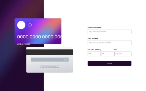
To fix the card number issue, assign it a max width property which will ensure that it doesnt exceed the card section. Also ensure that the card number is within the card section. It seems like the card and card number are two different section (both changes differently when screen size changes)
Am open for any corrects and I know the code is not the best
Nice job. You did quite well up there. You may find their are some issues with above design solution. First of all reduce the padding given to the whole section. Moreover, decrease the hero heading text size. Apply max width to both section so that it doesnt exceed beyond their respective assigned sizes (The company grid section is exceeding the assigned width). Applying the above changes can make the solution more better. Best of luck for the future.
👋 Hello Frontend Mentor Community!
I've recently completed a challenge and I'm excited to share my work with you all. Before I go into the details, I'd love to hear your insights and gather some feedback.
Here are a few questions I'd like to ask:
Design Choices: I made certain design decisions to match the provided design. Do you think my color choices and typography are fitting? Any suggestions for improvement?
Responsive Design: I aimed to make my project fully responsive. Could you please test it on different devices and let me know if everything adjusts as expected?
Accessibility: I understand the importance of accessibility. Have I implemented proper accessibility features? Any tips for enhancing the user experience for all users?
Code Structure: I focused on maintaining a clean and organized code structure. Is my code easy to understand? Any suggestions for optimizing it further?
Performance: Performance is crucial. Have I taken all necessary steps to ensure a smooth and fast user experience? Any suggestions for improving performance?
I'm really looking forward to your feedback! Your insights will greatly help me grow as a developer and improve my future projects.
Thank you all for your time and support! 🙌
Happy coding, jeansy42
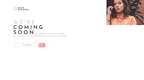
Great work. You have done quite well trying to replicate the design. You may foind that your image section is smaller and your detail section is bigger than that in the solution. You can fix it by giving specific width to both sections. Make the parent section width full and give the two section width half by using tailwindclass w-1/2. Overall, great job! Best of luck for the future
any feedback ?
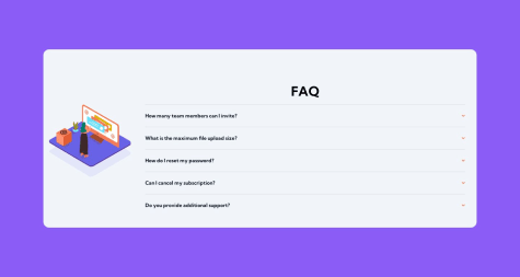
Great job. That was quite impressive. You may find that group names and post details are not bold. Try setting their font-weight value to bold. Great work overall. Best of luck for the future.
i'm a beinner, what should i improve on ?
Graet work! That is impressive. You may find some aspect of your design not matching the solution. Try setting the "border" to none. Increase the size by setting the "max-width" to 600px or more. Try using linear-gradient property on the left section. Overall great work
i would like some to point where i did some mistake and advice me how bocem better front end developper
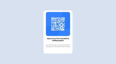
Nice job. You may find your solution to be smaller. You can fix that by setting the max-width value to 400px. Set thefont size to 16px for the text and 20px for the heading. I think that will look more perfect. Best of luck for future
Card components are basic tasks for CSS beginners, it can help with developing a firm foundation with structuring the layout and adding styles to its elements
Great job. You must have noticed that your text weight doesnt match one required in the design. To fix that use font-weight attribute to make the text font light. I think value of 400 would be fine