Design comparison
Solution retrospective
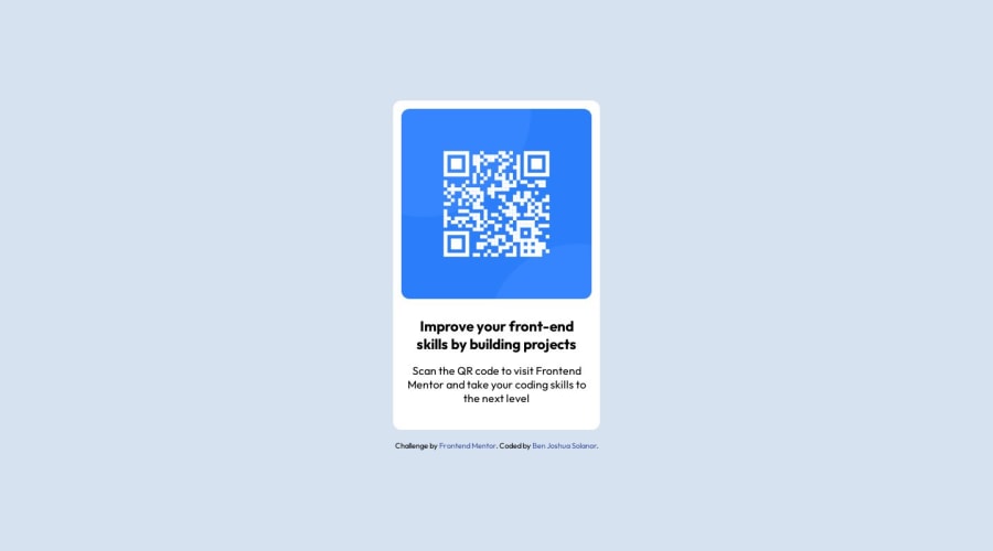
Card components are basic tasks for CSS beginners, it can help with developing a firm foundation with structuring the layout and adding styles to its elements
Community feedback
- @mmaazkhanherePosted over 1 year ago
Great job. You must have noticed that your text weight doesnt match one required in the design. To fix that use font-weight attribute to make the text font light. I think value of 400 would be fine
0@BenJooooooPosted over 1 year ago@mmaazkhanhere
Hi! Thank you so much for letting me know! I actually focused on the structure itself, as you may have noticed the color of the text description is supposed to be grey as well.
0@mmaazkhanherePosted over 1 year ago@BenJoooooo Yes. There are many to consider and I hope this was great learning opportunity for you.
0
Please log in to post a comment
Log in with GitHubJoin our Discord community
Join thousands of Frontend Mentor community members taking the challenges, sharing resources, helping each other, and chatting about all things front-end!
Join our Discord
