Design comparison
SolutionDesign
Solution retrospective
Am open for any corrects and I know the code is not the best
Community feedback
- @mmaazkhanherePosted over 1 year ago
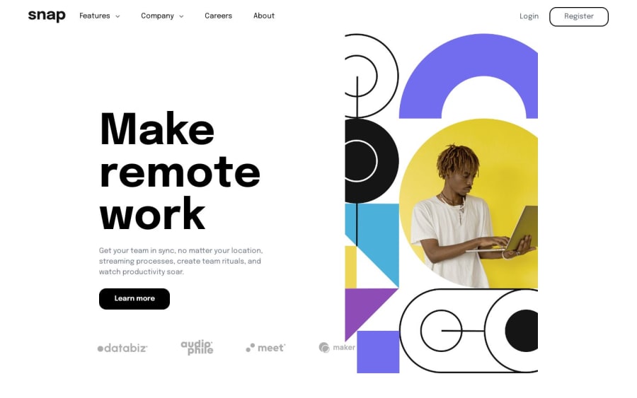
Nice job. You did quite well up there. You may find their are some issues with above design solution. First of all reduce the padding given to the whole section. Moreover, decrease the hero heading text size. Apply max width to both section so that it doesnt exceed beyond their respective assigned sizes (The company grid section is exceeding the assigned width). Applying the above changes can make the solution more better. Best of luck for the future.
Marked as helpful0
Please log in to post a comment
Log in with GitHubJoin our Discord community
Join thousands of Frontend Mentor community members taking the challenges, sharing resources, helping each other, and chatting about all things front-end!
Join our Discord
