Design comparison
SolutionDesign
Solution retrospective
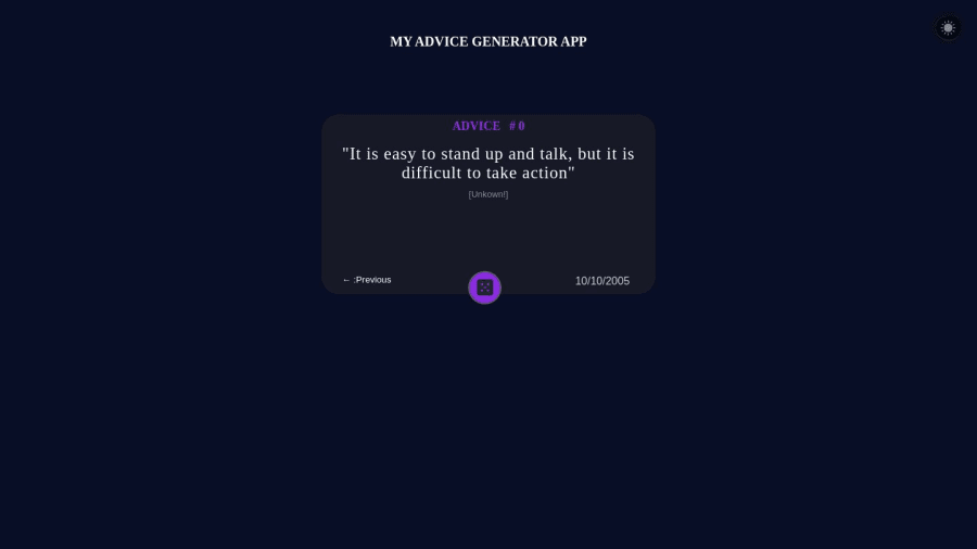
The only thing that was difficult for me was to add a button the displays the previous advice. I am not sure of the button the displays the next advice because it some how slow.
Community feedback
- @mmaazkhanherePosted about 1 year ago
Change the box color to somewhat lighter color to make it standout from its background. Great job
0
Please log in to post a comment
Log in with GitHubJoin our Discord community
Join thousands of Frontend Mentor community members taking the challenges, sharing resources, helping each other, and chatting about all things front-end!
Join our Discord
