
@SumayyahSayyedSubmitted over 2 years ago

Miguel Silva
@migsilva89All comments
- @migsilva89Posted over 2 years ago
I believe you can fix it with::
margin-top: 0; margin-bottom: 0; margin-left: auto; margin-right: auto;
Great job with the challenge, keep going.
Regards, Miguel Silva
0 - @umairanwerSubmitted almost 3 years ago@migsilva89Posted almost 3 years ago
Hey Umair, good job with the challenge.
I see that you have some HTML ISSUES, in order to fix them you should: consider the h1 element as a top-level heading only (all h1 elements are treated as top-level headings by many screen readers and other tools).
Keep going! Regards, Miguel Silva
0 - @sarahalvessaSubmitted about 3 years ago@migsilva89Posted about 3 years ago
Bom trabalho com este challenge.
Contudo a font parece nao e a mesma e o container fica muito esticado em ecras grandes.
Aconselho a usar um max-width to main cointainer, e como disse o Rodrigo poderia ser um pouco maior.
De resto muito bom, parabens.
Se o comentario ajudou de alguma forma, marque como useful pf :)
Bom codigo! Miguel
0 - @Crab-ProgSubmitted about 3 years ago@migsilva89Posted about 3 years ago
Nice job on this challenge. You have some HTML issues,
All page content should be contained by landmarks: https://dequeuniversity.com/rules/axe/4.3/region?application=axeAPI.
About your question, I believe the best solution is to use an input radio instead of a button. With the input radio, every time you select one the other is unselected.
Also, see that orange is the color on HOVER and dark gray is the color when you select it. This is a rating component so we should be able to select only one number.
Hope it helps, if so please mark it as helpful.
Happy code! regards,
Miguel Silva
0 - @aya-94Submitted about 3 years ago@migsilva89Posted about 3 years ago
Very good job with this challenge. In order to be pixel perfect, you can try to use Figma, and upload the design to it.
This way you are able to check the px and make it px perfect :)
Hope it helps.
Regards, Miguel Silva
Marked as helpful0 - @JoaotbbSubmitted about 3 years ago@migsilva89Posted about 3 years ago
Hi Joao, I see an HTML accessibility error "Images must have the alternate text".
More info :https://dequeuniversity.com/rules/axe/4.3/image-alt?application=axeAPI.
regards Miguel Silva
Marked as helpful0 - @Ibrahim-EltoukhySubmitted about 3 years ago@migsilva89Posted about 3 years ago
Good job!
I will advise you to use max-width on your body in order to match the challenge, I believe around 1000px will do the job.
The rest looks perfect.
For the accessibility issue please check:
- https://dequeuniversity.com/rules/axe/4.3/page-has-heading-one?application=axeAPI
Hope it helps, if so please marked as useful :)
Regards, Miguel Silva
Marked as helpful0 - @aya-94Submitted about 3 years ago@migsilva89Posted about 3 years ago
Good job with the challenge.
I think that you should take out position:absolute for the mobile version and use grid (1col 2 rows) for the mobile.
I also see that you are missing the background image on the desktop version.
Let me know if you need any help I can push your code and make some fixes.
regards, Miguel Silva
Marked as helpful1 - @fabiviegasSubmitted about 3 years ago@migsilva89Posted about 3 years ago
Ola Favi, muito bom para primeiro projecto.
Eu so aumentava um pouco a width de forma a melhor combinar com o design pedido.
De resto esta otimo,
vejo tambem que tem 3 HTML accessibility errors (The element button must not appear as a descendant of the a element.) Nao pode colocar o elemento <button> dentro de um <a> .Por favor marque como usefull se ajudou de alguma forma.
Boa programacao.
Miguel Silva
Marked as helpful0 - @maxkaiser100Submitted about 3 years ago@migsilva89Posted about 3 years ago
Good job completing this challenge
Your solution looks very good, I could see that the responsiveness on Ipad12 is not good, I will advise you to also make a @media for that screen size.
For the rest well done.
keep up the good work
Regards, Miguel Silva
Marked as helpful0 - @adhasanblogSubmitted about 3 years ago@migsilva89Posted about 3 years ago
Hi Fuad Hasan, congrats, the design is very close.
Just an advice, if you see it on bigger screens it gets messy, I believe you should use a max-width in your main container or do a @media for bigger screens.
For the rest, just keep up the good work.
Regards, Miguel SIlva
0 - P@Josh-D18Submitted about 3 years ago@migsilva89Posted about 3 years ago
Hi @Josh, I will advise you to use max-width on your body. To avoid that the squares get messy for bigger screens.
Keep up the good work!
regards Miguel
Marked as helpful2 - @tassieoshiroSubmitted about 3 years ago@migsilva89Posted about 3 years ago
Amazing work, congrats.
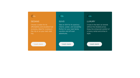
I would add max-width from 1600px, cause if you go bigger the side cards are getting separated from the middle ones.
For the rest looks perfect, well done!
Regards, Miguel Silva
Marked as helpful1 - @SlideurSubmitted about 3 years agoWhat are you most proud of, and what would you do differently next time?
I was able to redo the challenge in a simpler way.
What challenges did you encounter, and how did you overcome them?I've learnt how to read the values in figma. It's easier when you have the figma file to do the challenge.
@migsilva89Posted about 3 years ago@Slideur good job!
favicon-32x32 is the image in title bar.
<header> <link rel="icon" type="image/png" sizes="32x32" href="./images/favicon-32x32.png"> </header>Hope it helps, if so please marked as useful :)
Keep going!
regards, Miguel Silva
Marked as helpful0 - @sansarj17Submitted about 3 years ago@migsilva89Posted about 3 years ago
Well done!
In order to fix accessibility issues:
-
Document should have one main landmark: https://www.w3.org/TR/wai-aria-practices/examples/landmarks/main.html
-
All page content should be contained by landmarks: Wrap your card in a main element to fix accessibility issues by placing it just after the body element and draging your content inside.
About the size looks ok to me.
Hope it helps, and keep going!
Regards, Miguel Silva
Marked as helpful1 -
- @boluwatifeeeSubmitted about 3 years ago@migsilva89Posted about 3 years ago
Good job @boluwatifeee .
I see that the font size from the titles should be a bit bigger. Also you have hover effect on the buttons and also on the text inside the button, I will advise you to apply only to the buttons. Doing this way, text will also be white when you hover on the button.
For the responsive you can use mobile first, so you will make first the mobile design, then apply changes from x resolution, example:
//From 992px this will happen.
@media (min-width: 992px) {
.container {
    display: flex;
    align-items: center;
    justify-content: center;
    max-width: 1000px;
    margin: auto;
    padding-top: 100px;
}
Hope it helps, and keep going!
Regards, Miguel Silva
Marked as helpful0 - @Aadv1kSubmitted about 3 years ago
- @szymKamilSubmitted about 3 years ago