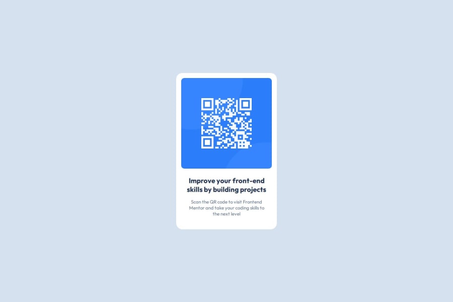


Design comparison

Solution retrospective
I was able to redo the challenge in a simpler way.
What challenges did you encounter, and how did you overcome them?I've learnt how to read the values in figma. It's easier when you have the figma file to do the challenge.
Community feedback
- @grace-snowPosted about 3 years ago
Hi
You need to
- use landmark elements - main for the card and footer for the attribution on this. This becomes more important on full webpages but it's good to get into the habit now
- you don't need to wrap img in a paragraph. Paragraphs are for text. It's usual to have a css reset at the start that would set all img tags to be display block and max-width 100%
- you are missing a heading in this. That's the one really important thing that's wrong in the html at the moment.
- you also need to remove all the brs in the heading and paragraph. Do not try to control line breaking like that - use max width on the card and let the lines break where they need to
Marked as helpful0@grace-snowPosted about 3 years agoA few really important learning points for your css too
- remove all the widths and height on this. You only need max width on the card and it should not have a height. If I have different font or zoom settings, or a small phone screen, this will break with a fixed height like that. In fact I just checked and the card does indeed overflow my phone screen at the sides because of its explicit width. Let the card be as high as it needs to be
- remove the height and width from the image too. Width 100% is enough to fill the space in the card and it will be as high as it needs to be
- remove the huge vertical margins on the card. You don't need it and all it does it make the card be in a really strange position on mobile
- font size should never ever be in px. Use rem
Marked as helpful0@SlideurPosted about 3 years ago@grace-snow Hello, Thank you very much for your help. I didnt't know the landmark main. I thought I must put img in a block landmark. in the futur, I won't wrap img in a paragraph. I'm sorry but i don't know how have a css reset at the start that would set all img tags to be display block and max-width 100%. I don't know how to do it. When you tell me that I'm missing the title, you're talking about the title h1? I will use max width on the card. For css, I'm trying to remove all the widths and height and using max width without height. and let the card be as high as it needs to be. Then I'll remove the huge vertical margins on the car and user rem for the font size. There are a lot of news informations tant I didn't know. You learn me some knowledges. Thank you. I'm beginner and it's not easy to learn. And sorry for my english, I don't speak well. Level A2 and a little b1
0 - @migsilva89Posted about 3 years ago
@Slideur good job!
favicon-32x32 is the image in title bar.
<header> <link rel="icon" type="image/png" sizes="32x32" href="./images/favicon-32x32.png"> </header>Hope it helps, if so please marked as useful :)
Keep going!
regards, Miguel Silva
Marked as helpful0@SlideurPosted about 3 years ago@migsilva89 thank you very much for your comment and your help for my question about the favicon 32x32. Regards, Slideur
0


Please log in to post a comment
Log in with GitHub
Join our Discord community
Join thousands of Frontend Mentor community members taking the challenges, sharing resources, helping each other, and chatting about all things front-end!
Join our Discord