Latest solutions
Responsive site using both Grid and Flexbox
PSubmitted 4 months agoI would love to get som help with the structure of HTML and CSS. I think I could get it even simpler.
Responsive site using flex and grid
PSubmitted 4 months agoIf there is anything that make my code even more lean.
Responsive Card using CSS grid
PSubmitted 9 months agoIs there any easier way to make the card responsive besides using media Queries?
Latest comments
- @SydsBikeSubmitted 4 months agoP@logstrup78Posted 4 months ago
Nice one. I like your comments in the stylesheet. Dont forget your ALT tags ;-)
Marked as helpful0 - @SydsBikeSubmitted 4 months agoWhat specific areas of your project would you like help with?
Any and all feedback is welcome!
P@logstrup78Posted 4 months agoNice work. I think the shadow on the cards, are a little bit to dark. I see that you have used the clamp() function in your CSS, I think I need to learn that.
Marked as helpful1 - @KocakAliSubmitted 6 months agoP@logstrup78Posted 6 months ago
Nice one. I like the way you used css to change the image in desktop mode.
0 - P@logstrup78Submitted 6 months agoWhat are you most proud of, and what would you do differently next time?
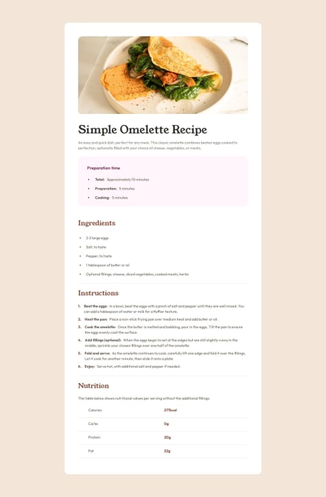
My mediaQueries works, that is good.
What challenges did you encounter, and how did you overcome them?I had som problems separating the numbers from the text in the ordered list. I tried different things, but couldn't get it to work.
What specific areas of your project would you like help with?The above!
P@logstrup78Posted 6 months agoHi Levi. Thanks a lot for your very nice feedback. I will definitely try to use the ::marker pseudo. I'm very grateful for your help.
Karsten
1 - @agusmcuelloSubmitted 6 months agoP@logstrup78Posted 6 months ago
Great work. It looks good, and everything seems to be correct.
Marked as helpful0 - @SultanFarrelSubmitted 7 months agoP@logstrup78Posted 7 months ago
Nice one. Maybe you could work a bit on the size compared to the original. I like that you have used Tailwind!
Marked as helpful1


