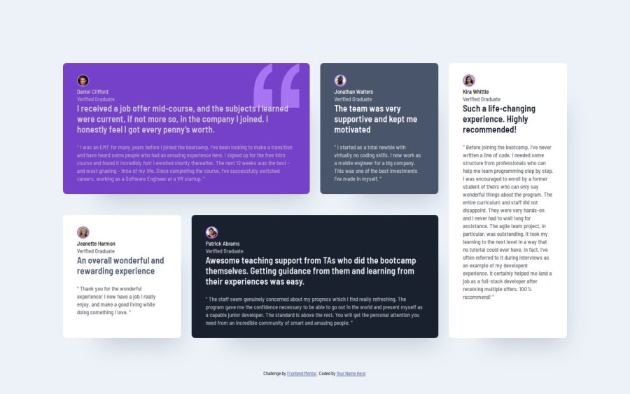


Design comparison

Solution retrospective
I think i am improving in speed, and I am getting better at structuring my HTML and my CSS.
What challenges did you encounter, and how did you overcome them?I had some difficulties getting the grid right. I found a solution, but i would love to have an easier way.
What specific areas of your project would you like help with?I would love to get som help with the structure of HTML and CSS. I think I could get it even simpler.
Community feedback
- @dar-juPosted 4 months ago
Hi Karsten Løgstrup!
You did a good job! You have no errors in the code, everything is in order with semantics. The code is clear and easy to read.
Flex is a good quality, but in this task you made your work more difficult. If you go through the paths on this resource, then before this task you talked about using grids. Grids are no less powerful tool than flexes. A front-end developer who understands where to use grids and where grids - will make the quality of the layout an order of magnitude higher.
In my opinion, learning grids is a little easier than flexes. I recommend to learn them. In grids, blocks can be managed very easily and arranged as you like.
Even if you decide to leave flexes, you will need to fix something:
- look at the screen resolution of 770 px, some columns are too thin, they are difficult to read. The transition point needs to be placed higher
- at 750 resolution there is too much empty space on the sides of the blocks, the blocks can be made wider
Otherwise, great job! Good luck with your development!
Marked as helpful1

Please log in to post a comment
Log in with GitHubJoin our Discord community
Join thousands of Frontend Mentor community members taking the challenges, sharing resources, helping each other, and chatting about all things front-end!
Join our Discord