Any feedback is welcomed :D
kubas33
@kubas33All comments
- @codewithxaviSubmitted over 1 year ago@kubas33Posted over 1 year ago
Input validation is broken. I can freely input month higher than 12, year higher than 20, 31 days in february etc
0 - @servant-of-AllahSubmitted over 1 year ago
Hello everyone,
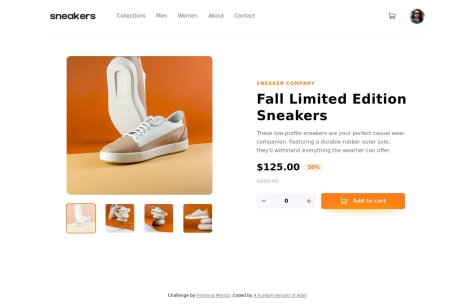
Alhamdulillah. I've completed the Ecommerce Product Page project on Frontend Mentor, and I'm excited to submit it for review. As a free user, I didn't have access to the design files, so I had to rely on my best guess approach based on the provided design images. Throughout the development process, I learned a lot, particularly in working with React, Vite, and Tailwind CSS. However, I would greatly appreciate your feedback and insights to help me improve the project further.
In order to make the most of your feedback, I would like to pose some specific questions:
What were the most challenging aspects you encountered while building this project? Are there any particular sections of my code that you find problematic or unclear? Do you have any suggestions for best practices or improvements that could be implemented in the project? Thank you in advance for taking the time to review my project and provide valuable feedback. Your input will be immensely helpful in my journey to enhance my frontend development skills.
@kubas33Posted over 1 year agoVery nice design!
But I found some bug.
When you raise items to be added to cart and then click "Add to cart" then it will be possible to change items in cart directly on main page (by +/- buttons).
I think you should be allowed to change number of items into cart only if you have cart opened and change value inside it.
1 - @legend-sabbirSubmitted over 1 year ago
Any advice is appreciated . For personal message contact me in telegram Legend Sabbir
@kubas33Posted over 1 year agoVery nice job! Although on mobile resolution the footer is little long (but I know that is needed in challenge design)
1 - @Victor-DurodolaSubmitted over 1 year ago@kubas33Posted over 1 year ago
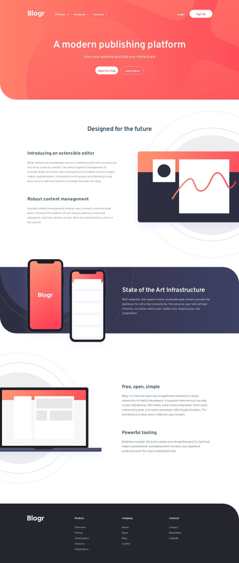
Overall your solution is very nice but unofrtunately it's not fully responsible - it adds horizontal bar on lower desktop widths.
0 - @imoyemiSubmitted over 1 year ago
I really enjoy taking this challenge and learn alot from it , I will really appreciate any feedback and how i can improve thanks in advance.
@kubas33Posted over 1 year agoI will not focus on code itself because I am beginner but I have some feedback according to UI.
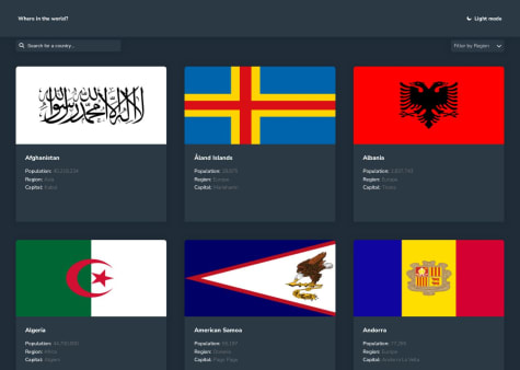
I think it's more intuitive that on Dark Mode version of site there will be Light Mode button and vice versa. Not Dark Mode button od Dark Mode version of site.
Additionaly it would be nice if we can go back to main site when we chose any country.
1 - @kubas33Submitted over 1 year ago
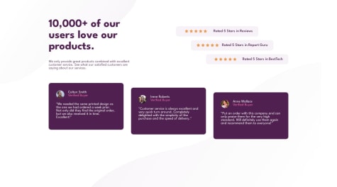
Solution according to Mobile-first workflow
Feedback and tips are welcomed
@kubas33Posted over 1 year agoHi! Thanks to your suggestion, appreciate it.
But can you tell me why you suggest to wrap content with article? I am trying to understand this so I know when to use this or not. I thought it isn't necessery to wrap component into another tag if there is only one section.
0


