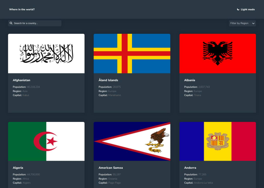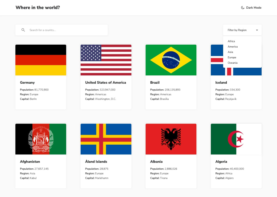
Design comparison
Solution retrospective
I really enjoy taking this challenge and learn alot from it , I will really appreciate any feedback and how i can improve thanks in advance.
Community feedback
- @MNSM92Posted over 1 year ago
Congratulation on completing this challenge! You did a lot. But there are a few things to improve. such that, onClick the border countries button should work. and you have the abbreviated name of the countries, you could change it to the actual name of the countries by using "find" method.
1 - @kubas33Posted over 1 year ago
I will not focus on code itself because I am beginner but I have some feedback according to UI.
I think it's more intuitive that on Dark Mode version of site there will be Light Mode button and vice versa. Not Dark Mode button od Dark Mode version of site.
Additionaly it would be nice if we can go back to main site when we chose any country.
1@imoyemiPosted over 1 year agoThanks for the feedback mate its really useful and ill work on it and then i add back btn that take it back to the main site where you can chose any country then ill work on the dark and light mode icon thanks @kubas33
1
Please log in to post a comment
Log in with GitHubJoin our Discord community
Join thousands of Frontend Mentor community members taking the challenges, sharing resources, helping each other, and chatting about all things front-end!
Join our Discord
