@a3-1811

Nguyen Duy
@koalalikecodeAll comments
- @koalalikecode
Hey Nguyễn Quang Huy, congrats on finishing your first challenge! It looks so close to the design, but I think there is something you can do to improve your page.
- Firstly, you should add the hover state to your page, use that
a:hover{ color:...;} - Secondly, your page should have the main tag(header > main > footer in that order); you had better wrap your section tags in the main tag.
Aside from that, good job on this challenge!
- Firstly, you should add the hover state to your page, use that
- @Shahab-Malikk@koalalikecode
Great work on this challenge bro, but I think you can have some regulations for a better job
- You should fix your body background with
background-size: contain; - If your div tag means main, you should use the main tag instead
- Your solution should be responsive for the mobile version.
- Your annual plan's height is too big compared to the design.
Happy coding!
- You should fix your body background with
- @Pablo-cyber21@koalalikecode
Hey Asiimawe, congrats on your first challenge. I think you have grasped a basic use of HTML and CSS, but you need to practice more on your next challenge.
- Firstly, your card is too big compared to the design, you can css your card class with
max-width: ...;background-color: white;and have your img in it and the container class withmax-width: 100%. You can try these codes. - Secondly, your background image should have css that
background-repeat: none;to remove the default value. - Try to use your h tag respectively, such as h1 -> h2 -> h3
- Finally, try to make your solution close to the design as much as you can.
Happy coding!
Marked as helpful - Firstly, your card is too big compared to the design, you can css your card class with
- @mmc1999@koalalikecode
Hey, great work on this challenge!
- I think you can use the icon on 'fontawesome' for network icons that you mentioned instead of images, then css the color of their hover state
- Moreover, I don't think you shorten links work well enough because I have to click on the button twice for the result, you can consult my code https://www.frontendmentor.io/solutions/shortly-url-shortening-api-challenge
- And you should use your h tag respectively, such as h1>h2>...
Aside from that, great work!
- @opplayz@koalalikecode
Congrats on finishing your challenge. It looks good for a beginner.
However, you can improve your code by taking some steps:
- Firstly, Instead of using a center tag
<center>, you had better use a main tag like this `<main>your codes</main> - Secondly, you should use CSS for regulating the value of images' width and height
<img class="musicicon" src="assets/icon-music.svg" alt="Music Icon" width="50%" height="50%"> - Moreover, use your CSS to make margin, it will make your Html code clearer.
<br> </br> - Finally, it will look better if you use an external CSS file instead of the internal one
Aside from that, great work!
- Firstly, Instead of using a center tag
- @ara6i@koalalikecode
Congrats for your first time, it looks so close to the design!
You can have some improvements for your code:
<h2>Order Summary</h2>You had better use you h tag respectively such as h1>h2>h3 and CSS them.<button class="button pay">Proceed to Payment</button>your Payment should be a descendant of a tag because it can link to another page- And add your body with
background-position: contain;. It will work well on a larger screen
Aside from those, great work!
- @developedBySwan@koalalikecode
It's a great solution. And I think it will be better if you use the main tag in this code:
<div class="main-container">for make the landmark clearly. And your background-image can use this for 100vw:main-container { background-size: cover;(work with contain too) } - @Briancarlo24
- @TGURUTEJA@koalalikecode
I think one of the aims of these challenges is to help us practice seeing dimensions without tools
- @DevmianS@koalalikecode
Great work, so close to the design! It will be perfect if some things change:
- You should use your tag h increase by one, such as h1>h2>h3,...
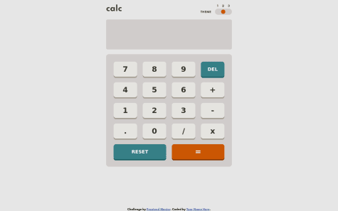
- I think your reset button should be active when I just have added a number in any inputs.
- And your select tip will be better if I can click again then turn off my last choice.
- @Jakeyikapp@koalalikecode
Great work, so close to design. But you should use your h tag respectively h1>h2>h3...
Marked as helpful - @DeboraBrum@koalalikecode
I think you should add the feature that when someone calculates several numbers respectively, he/she doesn't need to click the '=' button.
- @T3sultan@koalalikecode
I think you use the wrong color for "Proceed to Payment" and you should add the hover states