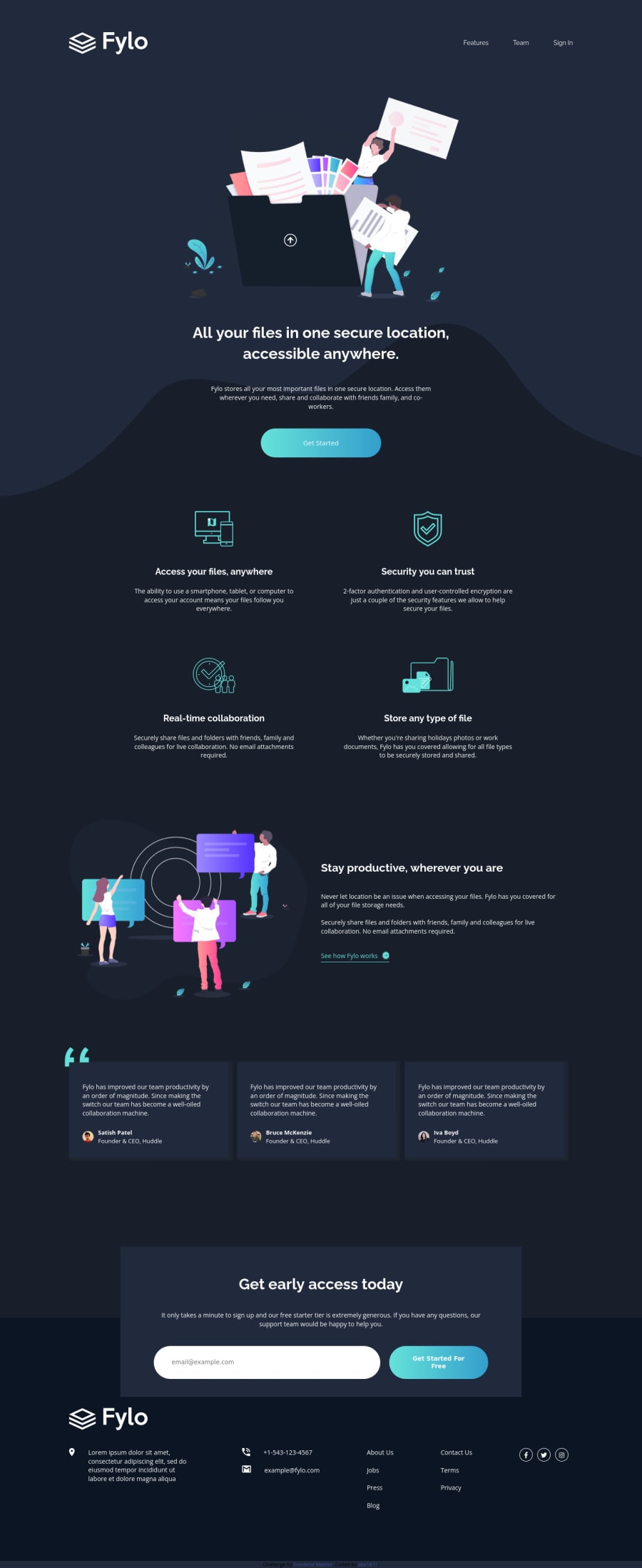
Design comparison
SolutionDesign
Solution retrospective
My first time got challenge form FrontendMentor!
Community feedback
- @koalalikecodePosted over 3 years ago
Hey Nguyễn Quang Huy, congrats on finishing your first challenge! It looks so close to the design, but I think there is something you can do to improve your page.
- Firstly, you should add the hover state to your page, use that
a:hover{ color:...;} - Secondly, your page should have the main tag(header > main > footer in that order); you had better wrap your section tags in the main tag.
Aside from that, good job on this challenge!
0 - Firstly, you should add the hover state to your page, use that
Please log in to post a comment
Log in with GitHubJoin our Discord community
Join thousands of Frontend Mentor community members taking the challenges, sharing resources, helping each other, and chatting about all things front-end!
Join our Discord
