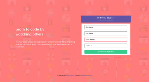
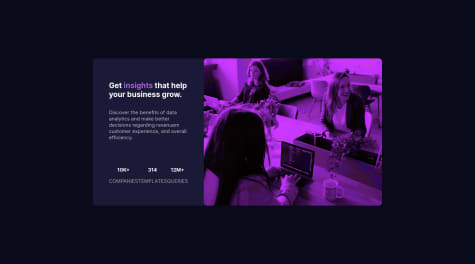
@thunkercSubmitted about 1 month ago

P
Hamza H.
@hhamza1All comments
- P@hhamza1Posted about 1 month ago
Great job on your solution! 🎉 The color scheme and typography are well-implemented, and your layout is clean and centered effectively. Using CSS variables for colors is a great touch for maintainability.
A few areas for improvement:
- Your deployment isn't working, so I couldn't preview the site properly—make sure the file paths and hosting setup are correct.
- The social links should be
<a>elements instead of<li>, so they are clickable and accessible. - Instead of setting
width: 80%on<li>, you can make the parent<ul>width 100%, ensuring consistent sizing without stretching individual items.
Overall, it's a solid implementation with some minor refinements needed. Keep up the great work! 🚀
0 - @SerebroinnaSubmitted about 1 month agoWhat are you most proud of, and what would you do differently next time?
En este challenge preste mas atencion a los detalles del disenio en figma y creo que consegui una solucion muy precisa.
What challenges did you encounter, and how did you overcome them?Estuve batallando con la etiqueta de "learning" ya que yo pensaba que llevaba un padding pero no lograba conseguir que se pareciera al disenio original.
What specific areas of your project would you like help with?En la estructura semantica de HTML, yo suelo utilizar div en la mayorias de las secciones, pero me gustaria saber si es una buena practica.
P@hhamza1Posted about 1 month agoGreat job on your solution! 🎉 The overall styling is well-executed, and your hover effect on the title adds a nice interactive touch. Your layout is structured effectively, and the box-shadow and flexbox implementation work well, even though these details were not strictly defined in the design.
A couple of small refinements to consider:
- Moving inline styles to the CSS file would improve maintainability.
- The card height doesn’t need to be fixed—allowing it to adjust dynamically would make it more adaptable.
- The tag section (
#etiqueta) could be more flexible by usingwidth: fit-content;instead of a fixed width.
Overall, solid work with minor areas for enhancement! 🚀 Keep it up!
0 - @Switzer-learnSubmitted about 1 month agoP@hhamza1Posted about 1 month ago
@Switzer-learn, your typography handling with
.outfit-400and.outfit-700is a nice touch, making font styles modular. The layout is clean, and your approach keeps the CSS concise.A few areas for improvement:
- Your repo structure needs fixing to ensure
index.htmlloads correctly in the live preview. - Add an
altattribute to the QR code image for better accessibility. - Consider using a media query to enhance responsiveness on larger screens.
- The
text-wrap: 1;property isn’t valid—consider removing or adjusting it.
Overall, a solid solution with room for refinement! Keep up the great work! 🚀
0 - Your repo structure needs fixing to ensure
- @TristanBerger6Submitted over 3 years ago
- @AlbusflamesSubmitted over 3 years agoP@hhamza1Posted over 3 years ago
You need to improve the inputs design instead of using the default one.
Keep up the good work
0 - @XephileSubmitted over 3 years agoP@hhamza1Posted over 3 years ago
Why do you have an overflow:scroll on the component's content in the mobile version?
Always avoid setting height property at all cost, you need to have the elements set on the page then start working the layout based on the viewport. You will still need to refactor your code.
I would suggest you go and check some of the solutions and compare and understand.
Good job on the effort and keep practicing.
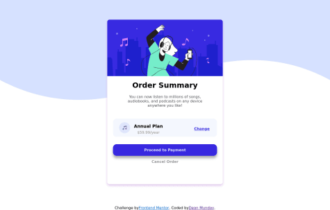
1 - @jgrospe92Submitted over 3 years agoP@hhamza1Posted over 3 years ago
First of all, good job on the delivery.
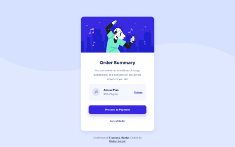
Although you started with a desktop approach, you could still have a couple of things to set and you won't have to do much on the mobile view. Setting the display flex on the body would have made your work much easier, also you could have set a max-width to the card, that would have helped also with the responsiveness, box shadow should be fixed, bg-color and pattern could be also fixed.
You might check my solution for more details : https://www.frontendmentor.io/solutions/order-summary-card-component-with-flex-MHX37axfl
My approach was mobile-first view. It's much easier to expand to other screen sizes afterwards, not much CSS to write.
Keep up the good work
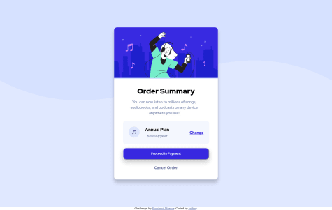
Marked as helpful1 - @Amirmardan-progSubmitted over 3 years agoP@hhamza1Posted over 3 years ago
Also you need to review your mobile view. Keep up the work
0 - @ObjectOrientedMindsetSubmitted over 3 years agoP@hhamza1Posted over 3 years ago
The mobile-view is not working. Please check that
Marked as helpful0 - @rajesh0406Submitted over 3 years agoP@hhamza1Posted over 3 years ago
Hi @rajesh0406,
For such exercise, maybe going mainstream instead of using libraries and frameworks would be a better practice, so you can be able to improve your basic skills. IMO, the key here is to properly use flexbox, as it would suffice and you'll be able align the card perfectly, also you'll need to fix the padding on the card component left section.
Keep up the good work.
Marked as helpful1 - @newlomarSubmitted over 3 years agoP@hhamza1Posted over 3 years ago
You did a good work respecting the semantic, I suppose one small thing to review for the card text section is the padding to try to make your work pixel perfect. Keep up the good work and motivation.
Have a great day
Marked as helpful1 - @blurrypxlSubmitted over 3 years agoP@hhamza1Posted over 3 years ago
Nice work! One small thing I would suggest is to slow down the accordion animation a little bit, it's too quick.
1 - @MishaHernandezSubmitted about 4 years agoP@hhamza1Posted about 4 years ago
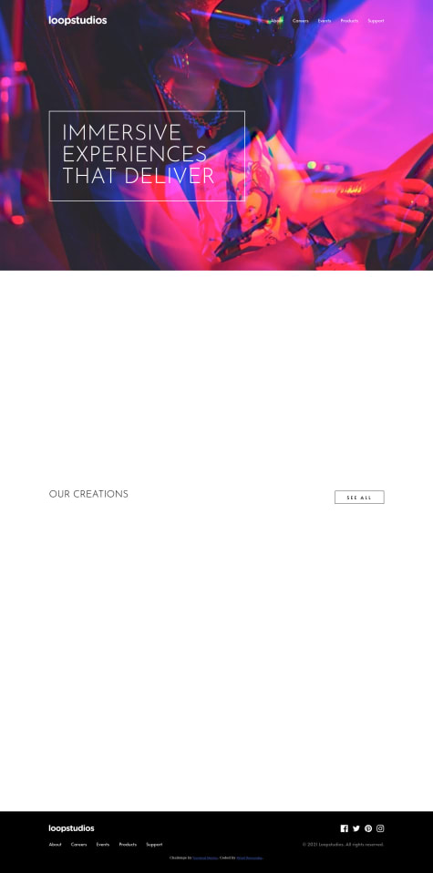
Hi Mijail. I loved the animations you added. A slight issue I noticed, when I hover over the elements on the creations section, there is a shaking when opacity changed.
Great job!
1 - @IvanGH4Submitted about 4 years agoP@hhamza1Posted about 4 years ago
I would suggest to you to give the button a depth effect when clicked (you can play with box-shadow to figure that out). Keep up the good work!
0 - @SamyrORSubmitted about 4 years agoP@hhamza1Posted about 4 years ago
@SamyrOR, bro you need to check the preview you posted. It's not working.
1 - @thebigdavecSubmitted over 4 years agoP@hhamza1Posted over 4 years ago
I liked the way you added the background patterns. I used the background images and their positioning.
0