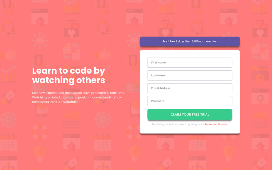
Design comparison
Solution retrospective
I wasn't sure on how to make the form validation, so any advice will be really appreciated! Thank you!
Community feedback
- Account deleted
Hi Ivan i like your solution it's responsive and looking great.
2 - P@hhamza1Posted about 4 years ago
I would suggest to you to give the button a depth effect when clicked (you can play with box-shadow to figure that out). Keep up the good work!
0
Please log in to post a comment
Log in with GitHubJoin our Discord community
Join thousands of Frontend Mentor community members taking the challenges, sharing resources, helping each other, and chatting about all things front-end!
Join our Discord
