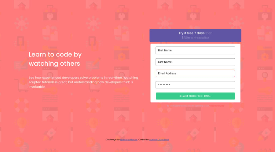
Design comparison
Solution retrospective
i need a feedback on how to use the form pattern validation attribute, along with any other validation links that can be of help
Community feedback
- P@hhamza1Posted over 3 years ago
You need to improve the inputs design instead of using the default one.
Keep up the good work
0@AlbusflamesPosted over 3 years ago@hhamza1 alright. i appreciated the feedback , but can u be more detailed on what input design?
0P@hhamza1Posted over 3 years ago@Albusflames Hi, what I meant is the border and the padding of the input, the font of the placeholder.
The title of the page size should be fixed.
The buttons should be reviewed as they are missing the box-shadow property.
In general, you delivered the layout but not pixel perfect. That's where you can enhance your CSS skills.
You could check my solution if you want to see what I am talking about.
Keep up the good and best of luck in your learning journey
Marked as helpful0
Please log in to post a comment
Log in with GitHubJoin our Discord community
Join thousands of Frontend Mentor community members taking the challenges, sharing resources, helping each other, and chatting about all things front-end!
Join our Discord
