Design comparison
Solution retrospective
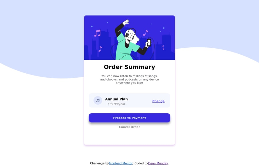
Order Summary card, responsive from everything between a desktop and a mobile!
Community feedback
- P@hhamza1Posted over 3 years ago
Why do you have an overflow:scroll on the component's content in the mobile version?
Always avoid setting height property at all cost, you need to have the elements set on the page then start working the layout based on the viewport. You will still need to refactor your code.
I would suggest you go and check some of the solutions and compare and understand.
Good job on the effort and keep practicing.
1 - @afrusselPosted over 3 years ago
- Backgound color is missing. Aslo in small windows below section ki broken up. While you inspect your browser you can see this
1
Please log in to post a comment
Log in with GitHubJoin our Discord community
Join thousands of Frontend Mentor community members taking the challenges, sharing resources, helping each other, and chatting about all things front-end!
Join our Discord
