@wesenSubmitted almost 3 years ago
I went a bit deeper with this one. I used next and supabase, deployed on vercel. I created a reducer for the state handling, with jest unit tests. It was fun!

I went a bit deeper with this one. I used next and supabase, deployed on vercel. I created a reducer for the state handling, with jest unit tests. It was fun!
Nice work man, just in case. Do you have a Youtube channel? this code worthy it to be explained.
Any feedback/suggestions would be highly welcomed. Thank you.
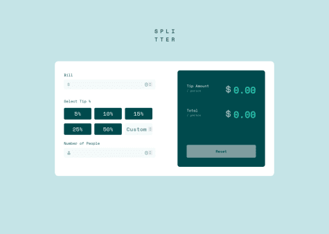
Hi olabayoji, there is another way to work with buttons that change color when clicked, You can mask them as buttons but they are really radio buttons:
<ul class="tip-button-container"> <li class="tip-button"> <input type="radio" name="tip" id="t5" value="5"> <label for="t5">5%</label> </li> <li class="tip-button"> <input type="radio" name="tip" id="t10" value="10"> <label for="t10">10%</label> </li> <li class="tip-button"> <input type="radio" name="tip" id="t15" value="15"> <label for="t15">15%</label> </li> <li class="tip-button"> <input type="radio" name="tip" id="t20" value="20"> <label for="t20">20%</label> </li> <li> <input type="text" placeholder="Otro"> </li> </ul>the the CSS: .tip-button-container{ display: flex; justify-content: flex-start; align-items: flex-start; flex-wrap: wrap; width: 100%; height: auto; } .tip-button{ display: flex; justify-content: center; align-items: center; } .tip-button-container li { outline:none; margin: 10px 12px 0px 0px; padding: 13px; border:0; width: 30%; height: 40px; background: var(--Very-dark-cyan); position: relative; list-style-type: none; border-radius: 4px; color:#fff; } .tip-button-container label, .tip-button-container input { display: block; position: absolute; top: 0; left: 0; right: 0; bottom: 0; }
.tip-button-container input[type="radio"] { opacity: 0.01; z-index: 100; }
.tip-button-container input[type="radio"]:checked+label, .Checked+label { background: var(--Strong-cyan); }
.tip-button-container label { padding: 5px; border: 0; cursor: pointer; z-index: 90; border-radius: 5px; text-align: center; }
.tip-button-container label:hover { background:var(--Light-grayish-cyan); color:#333; border: 0; border-radius: 5px; }
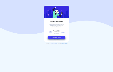
This is my first challenge solved using HTML and CSS only. I had some difficulties creating the center of the card, specifically positioning the music icon, the letters, and the link next to it. I used absolute positioning, any easier solution for that part? Thank you!
Anytime! Im also new here and I'm trying to solve as much challenges as I can. If you need more in depth explanation just let me know.
This is my first challenge solved using HTML and CSS only. I had some difficulties creating the center of the card, specifically positioning the music icon, the letters, and the link next to it. I used absolute positioning, any easier solution for that part? Thank you!
Hi Mariana, I have some suggestions 1- Body background: You can use some properties for image, like: body{ height: 100vh; background-repeat: no-repeat; background-color: aliceblue;(choose yours) }
2- To center a div: You could use Flex like this: wrap the card in a container .card-container{ display: flex; justify-content:center; align-items:center; } 3- name ".main-container" as ".card" Congratulation for your effort.