Interactive Comments (next.js, supabase, jest, tailwind)
Design comparison
Solution retrospective
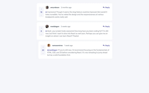
I went a bit deeper with this one. I used next and supabase, deployed on vercel. I created a reducer for the state handling, with jest unit tests. It was fun!
Community feedback
- @carlwickerPosted almost 3 years ago
Hey ya Joako, great work on the layout, I noticed a few minor issues.
- A user can upvote multiple times.
- Desktop version should have a larger indent on replies, see design files.
- Missing CreateAt field displayed on a comment.
- Fix accessibility and HTML issues in the report.
Keep up the great work.
Marked as helpful0@wesenPosted almost 3 years ago@carlwicker Yes indeed, the createdAt field seems to have broken when I deployed on vercel, I will investigate. Should the +/- be bolded when they have been pressed (like reddit)?
0@wesenPosted almost 3 years ago@carlwicker The padding was a conscious choice, I actually liked the way it looked. It can now indent up to 5 levels before reverting to the "flattened" behaviour the mobile layout has, I thought that was more interesting.
0@carlwickerPosted almost 3 years ago@wesen I believe the indent on replies is meant to be one level and replies rely on @username tagging. But your solution is equally as valid.
You can get rid of that final accessibility issue by adding a h1 with a font-size of 0. Bit of a hack but clears the final issue in the report.
Great work!
Marked as helpful0@carlwickerPosted almost 3 years ago@wesen I not sure how we can implement the only being able to click the score button once, personally I think this is an error in the data supplied, I think score should be an array of usernames rather than a number. I'm not familiar with Reddit +/- buttons.
0@wesenPosted almost 3 years ago@carlwicker thanks carl, it was a fun project for sure!
0 - @xvferdyPosted almost 3 years ago
Hey this is cool man, are my comments gonna stay there forever?
1 - @hecmen84Posted almost 3 years ago
Nice work man, just in case. Do you have a Youtube channel? this code worthy it to be explained.
1@wesenPosted almost 3 years ago@hecmen84 I don't have a youtube channel, and I'm not sure this is really great code (I'm a bit new to modern web development). I'm happy to answer questions or record a video if you want to know more.
0 - @Muhammad-Hamza-SaeedPosted almost 3 years ago
how long did it took you to complete this?
0@wesenPosted almost 3 years ago@Muhammad-Hamza-Saeed i would say 2 days. i'm a reasonably experienced developer, but new to modern js and CSS.
0 - @wesenPosted almost 3 years ago
I added server side rendering, and replaced the js based responsive solution with a fully grid-based solution.
0
Please log in to post a comment
Log in with GitHubJoin our Discord community
Join thousands of Frontend Mentor community members taking the challenges, sharing resources, helping each other, and chatting about all things front-end!
Join our Discord