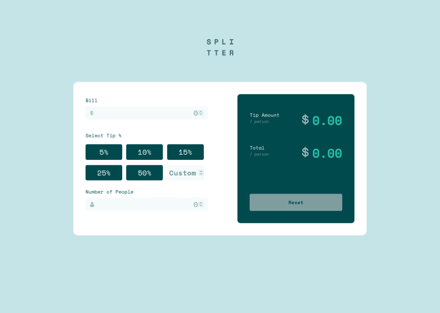
Design comparison
Solution retrospective
Any feedback/suggestions would be highly welcomed. Thank you.
Community feedback
- @pikapikamartPosted about 3 years ago
Hey, awesome work on this one. Layout in desktop looks fine, just needed for it to be centered vertically. The responsive state could be better since right now, at 960px going down to 684px, a large section is being hidden thus creating a horizontal scrollbar. The mobile layout looks fine but a small scrollbar is present as well.
Some other suggestions besides the logic for the tip:
- The
altfor the website-logo should have usedalt="splittier", the image already has the text so better using it. Also, as always avoid words that relates to "graphic" such as "logo", always use meaningful words for meaningful images. - For the
formyou are using too muchgrid, actually you don't really need that in there, since the layout is just one column. Those tips is just one container with aflex. - For the bill
inputadd amin=0attribute so that whenever using arrow-key, the value won't go lower down the specified value which is 0. - The dollar icon on the
inputshould have usedalt=""andaria-hidden="true"as an extra attribute. Decorative images should be hidden for users. - To be honest, I find it hard to use structure html on the tips section, but for me, I would use
input type="radio"on the 5 items which is being wrapped byfieldsetalong with ansr-onlylegendelement. This way, users will know directly what does this set of items will do and will be easier for them to select one. Because using onlybuttondoes not add extra accessibility features, unless you usearia-liveelement. - The custom
inputneeds to have alabelassociated with it, thelabelwill be havingsr-onlyclass, then the text should describe what does theinputdoes. - Again
min=0for the custominput. - For the number of people
inputeven if I put 0 or negative values, the error-message doesn't seem to appear, you might want to check that one out. - The
altfor the icon on the numberinputshould bealt=""andaria-hidden="true". - The
tip amountand thetotalcould use some heading tags, since it is a section that shows the value. - The dollar sign again should be hidden, using the above method that I mentioned.
- You don't have to use
input type="reset"on this one, since theinputis not inside theformif you are going to use this, you must include it inside theformto work properly. But since it is not, you might want to just usebuttonelement for this one. As an extra accessibility, anaria-liveelement announcing that the form has reset would be really great.
Aside from those, great work. But look at the responsiveness that was mentioned above.
Marked as helpful0 - The
- @hecmen84Posted about 3 years ago
Hi olabayoji, there is another way to work with buttons that change color when clicked, You can mask them as buttons but they are really radio buttons:
<ul class="tip-button-container"> <li class="tip-button"> <input type="radio" name="tip" id="t5" value="5"> <label for="t5">5%</label> </li> <li class="tip-button"> <input type="radio" name="tip" id="t10" value="10"> <label for="t10">10%</label> </li> <li class="tip-button"> <input type="radio" name="tip" id="t15" value="15"> <label for="t15">15%</label> </li> <li class="tip-button"> <input type="radio" name="tip" id="t20" value="20"> <label for="t20">20%</label> </li> <li> <input type="text" placeholder="Otro"> </li> </ul>the the CSS: .tip-button-container{ display: flex; justify-content: flex-start; align-items: flex-start; flex-wrap: wrap; width: 100%; height: auto; } .tip-button{ display: flex; justify-content: center; align-items: center; } .tip-button-container li { outline:none; margin: 10px 12px 0px 0px; padding: 13px; border:0; width: 30%; height: 40px; background: var(--Very-dark-cyan); position: relative; list-style-type: none; border-radius: 4px; color:#fff; } .tip-button-container label, .tip-button-container input { display: block; position: absolute; top: 0; left: 0; right: 0; bottom: 0; }
.tip-button-container input[type="radio"] { opacity: 0.01; z-index: 100; }
.tip-button-container input[type="radio"]:checked+label, .Checked+label { background: var(--Strong-cyan); }
.tip-button-container label { padding: 5px; border: 0; cursor: pointer; z-index: 90; border-radius: 5px; text-align: center; }
.tip-button-container label:hover { background:var(--Light-grayish-cyan); color:#333; border: 0; border-radius: 5px; }
Marked as helpful0@OlabayojiPosted about 3 years ago@hecmen84 Thank you so much. Using the radio button to select and deselect the tip percentage value is a great idea. Would never have thought of it. 🤝
0 - Account deleted
Hi,
Nice one on completing the challenge, it works but I don't think it's correct;
- The math seems to be incorrect, like it's not even close;
- A
bill of $20and atip of 25%and4 peoplegives me atip amount / person of $5and atotal / person of $10... as you can see that's way overboard. - The tip is some how correct but you have to divide it by the number of people to get the
tip amount / person, so it'll have to be5 / 4 = $1.25. - For the
total / personyou first have todivide the bill by the number of peoplein this case it'll be20 / 4 = $5, plus thetip amount / person; so thetotal / person is $5 + $1.25 = $6.25
And on the other side the styling also needs a little bit of work.
1@OlabayojiPosted about 3 years ago@thulanigamtee haha. I don’t even know what I was thinking 🤦🏾♂️. I’d go correct my formula.
0
Please log in to post a comment
Log in with GitHubJoin our Discord community
Join thousands of Frontend Mentor community members taking the challenges, sharing resources, helping each other, and chatting about all things front-end!
Join our Discord
