...made with a lot of love 🤘🏻🙂
Muqtadeer
@hashmi7917All comments
- @CheosphereSubmitted 11 months ago@hashmi7917Posted 11 months ago
apple designer is looking for you bro, what a amazing work perfect. one more request kindly share your learning resources and tips and tricks to follow or any learning path would be helpfull ;)
2 - @CheosphereSubmitted about 1 year ago
...made with a lot of love 🤘🏻🙂
@hashmi7917Posted about 1 year agomasterpiece , need to learn lot from you , one more thing bro plz make youtube channel or somewhere we can learn techniques from you.
6 - @fahriTrhSubmitted about 1 year ago
No one cares about this.
@hashmi7917Posted about 1 year agobeautifully implemented, i'm fan of your now
Marked as helpful1 - @CheosphereSubmitted almost 2 years ago
...made with a lot of love 🤘🏻🙂
- @omaimarababaaSubmitted about 2 years ago@hashmi7917Posted about 2 years ago
hi Omaima, i have some suggestions for you here it is. firstly dont give grid column n rows in fixed pixels , alternatively you can give "fr" ex: repeat(4, 1fr). by using pixels u cant get responsive design.
0 - @tylerbryceobierSubmitted about 2 years ago
This was a pretty interesting project from the start. I have been currently learning about using grid and flexbox. I tinkered around with both grid from the start and later decided flexbox is probably the way to go with this one. I have had a problem im not sure why the button at the lowest breakpoint would not width 100% on google chrome but was working perfectly in firefox browser. Im not totally sure if the breakpoint and media queries was the most reliable way to achieve this result. I am open for suggestions on thing that could be fixed or change.
@hashmi7917Posted about 2 years agoadd this code to media @ 450px .product__card { width: 100% } this will solve button issue
Marked as helpful0 - @correlucasSubmitted about 2 years ago
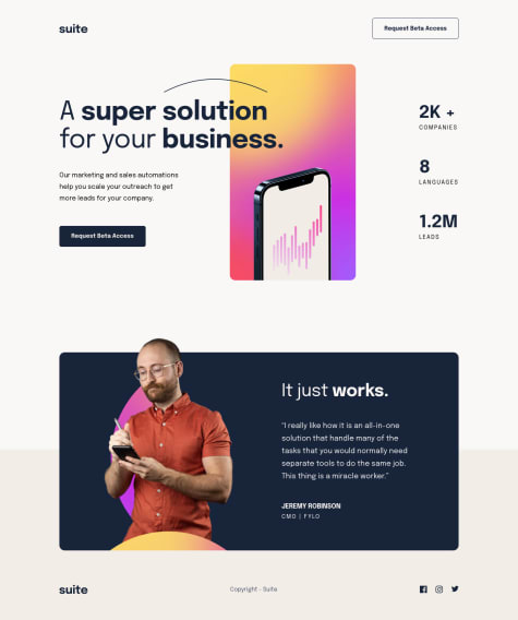
👾 Hello, Frontend Mentor coding community. This is my solution for the Suite Landing Page
I struggled a lot positioning the hero image and the heading decoration on this challenge, was really challenging place both elements between the mobile and tablet sizes. There's a lot of aspects to improve in my CSS writing, but I am happy with the result in this challenge.
🎨 I added some custom features:
- 👨🔬 Custom UI Design + Logo.
- 🧚♀️ CSS Animations
🍚Follow me in my journey to finish all
HTML/CSSonly challenges (Only 2 missing)! Gotta Catch ’Em AllIll be happy to hear any feedback and advice!
- @HualDevSubmitted about 2 years ago
I'd like to read your comments to improve my skills.
@hashmi7917Posted about 2 years agoas i have done this challenge also, i can suggest to give max-width & max-height to image also you may set aspect-ratio on mobile deign.
Marked as helpful0 - @martinsgfxSubmitted about 2 years ago
- I couldn't get a space between the icon and the text of my button
- I couldn't get rid of the button border that was back
- I couldn't adjust the kerning of the Perfume text
- I have issues adding an image to my div to contain the div size
@hashmi7917Posted about 2 years agoyou can fix that overflow giving max-width to containers, also h1 font-size is to big
Marked as helpful0 - @JoyObaiduSubmitted about 2 years agoWhat are you most proud of, and what would you do differently next time?
Searching for new methods that I don't know of
What challenges did you encounter, and how did you overcome them?Aligning the content
What specific areas of your project would you like help with?css margins
@hashmi7917Posted about 2 years agodo you need any help in this challenge, because your solution is incomplete
0 - @RosaGR01Submitted about 2 years ago@hashmi7917Posted about 2 years ago
remove h2 element and replace with h1 it will fix your accessibility issues
Marked as helpful1


